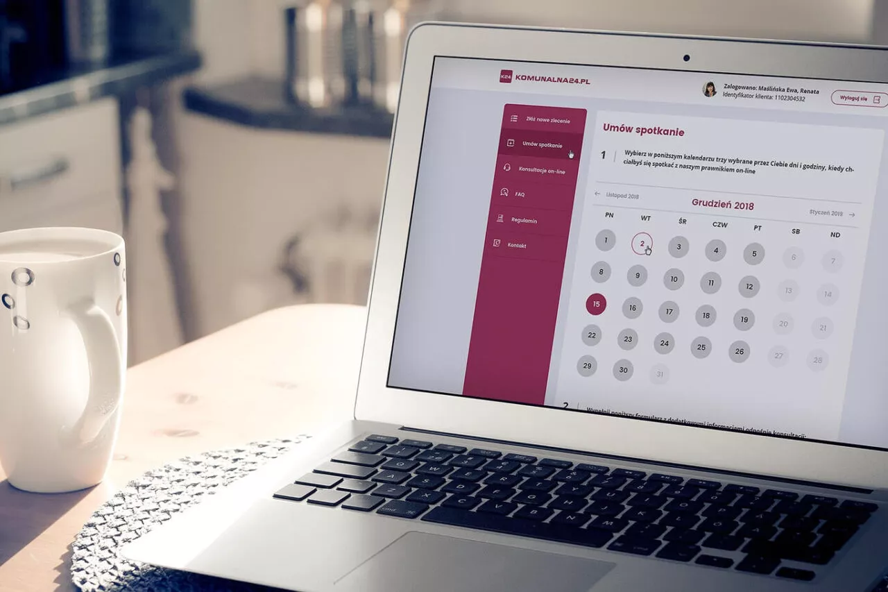
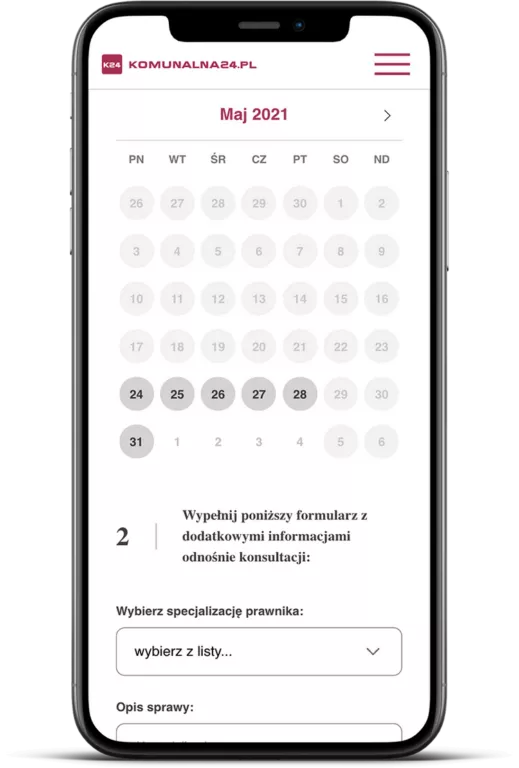
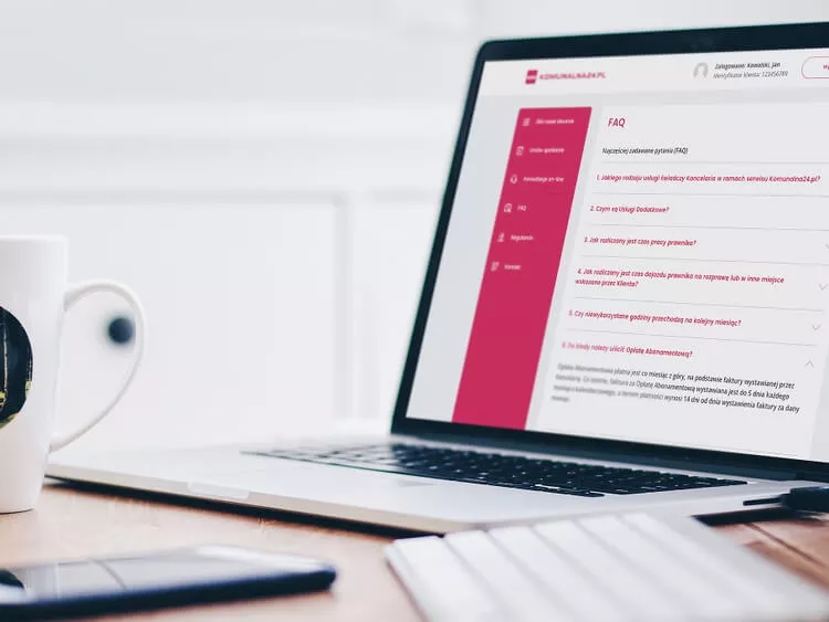
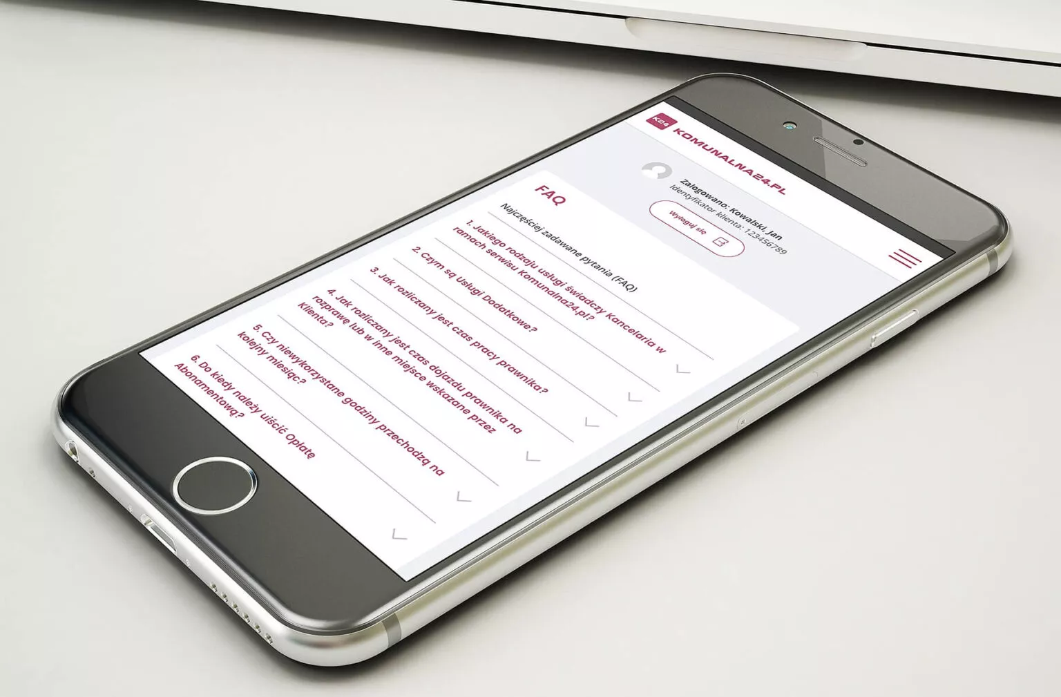
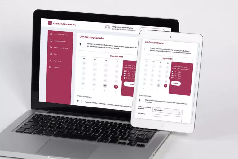
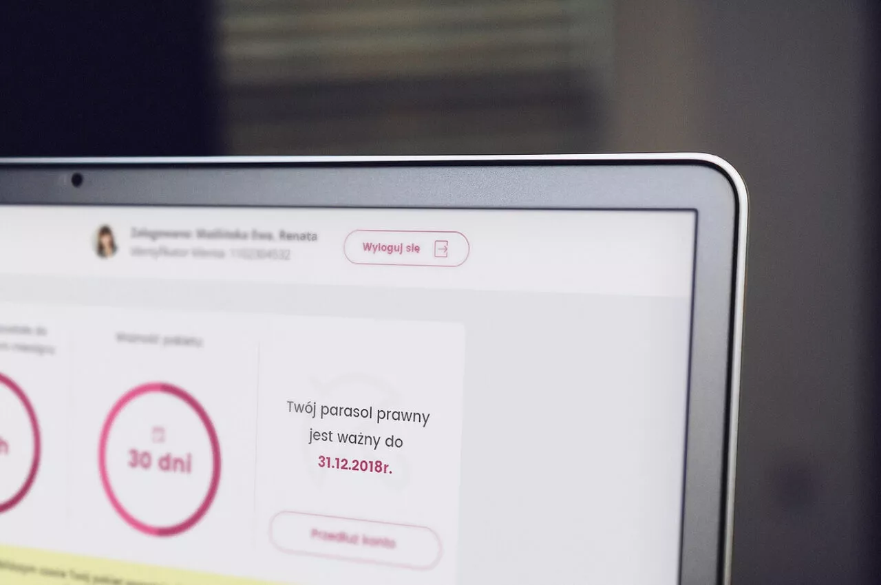
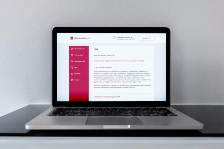
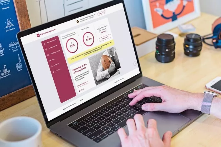
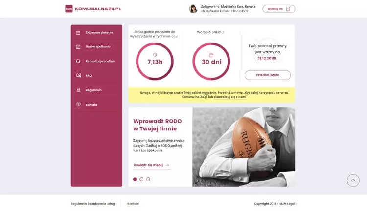
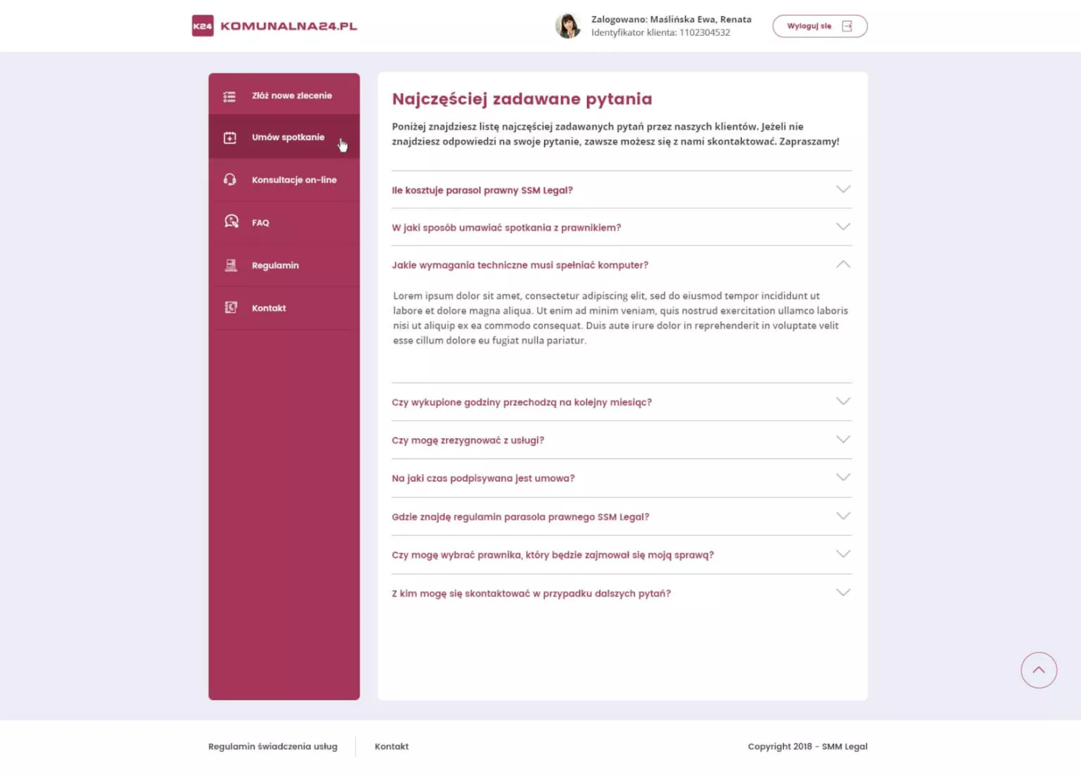
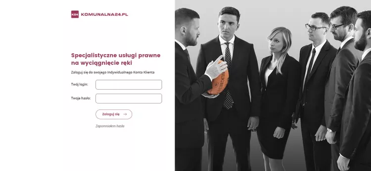
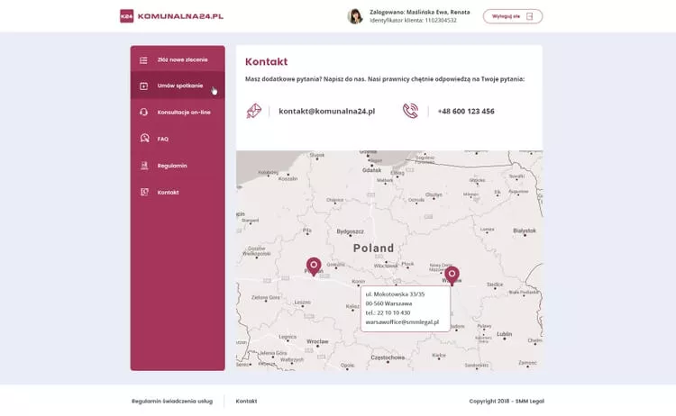
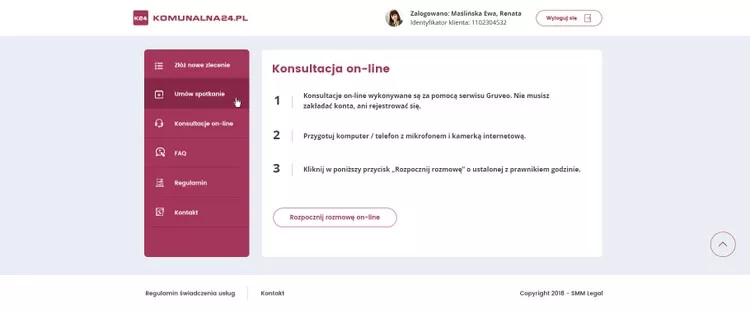
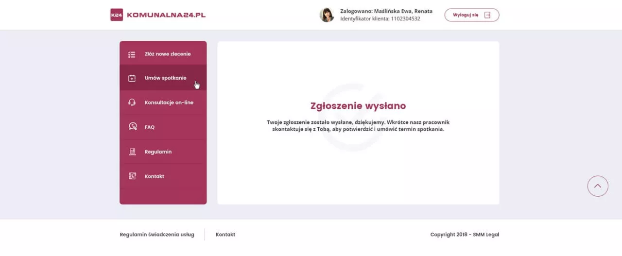
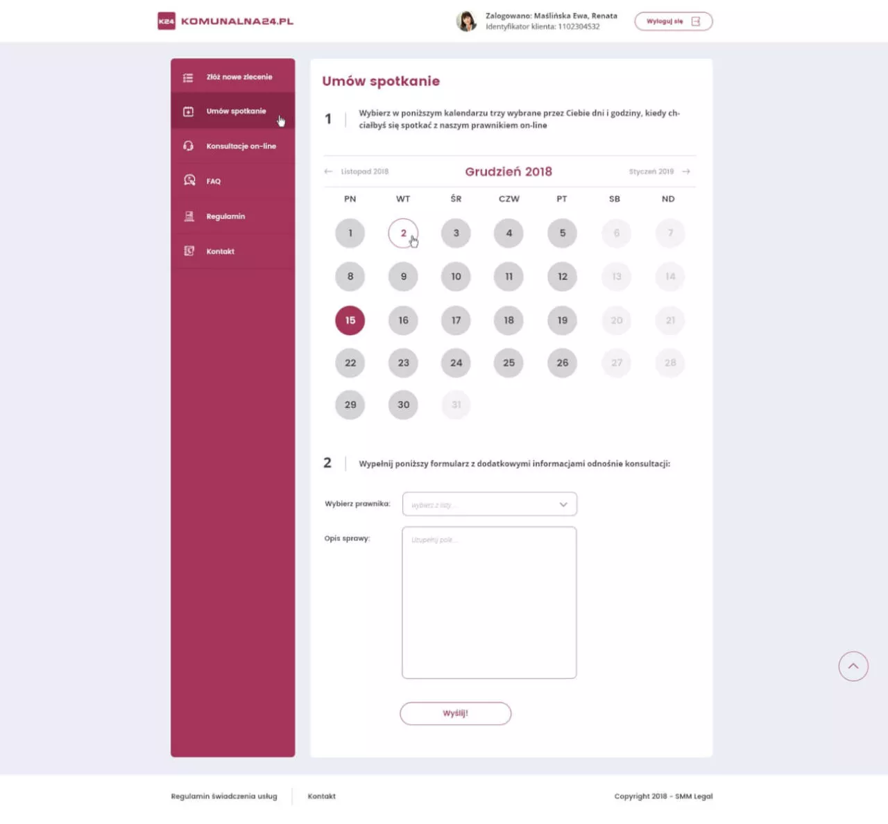
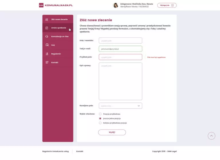
After reviewing the site guidelines and mockups, we prepared a graphic design that used the characteristic colour which is the brands distinctive feature. We put emphasis on the greatest possible functionality and availability of options – that is why we decided to implement the menu located on the left side of the window. Thanks to this, the place is very well developed.
When we got the approval of the graphic designs, we started programming work. It was very important for us not only to obtain the appropriate optimization of the site, but above all to ensure security and a sense of privacy, which is very important in the lawyer-client relationship. The solutions we used have allowed us to secure the system and sent forms.
The website has been supplemented with the provided content, and the administrative background has been prepared in such a way that the administrator has full control over the user account, where they can make changes to the used hours and duration of the subscription.

