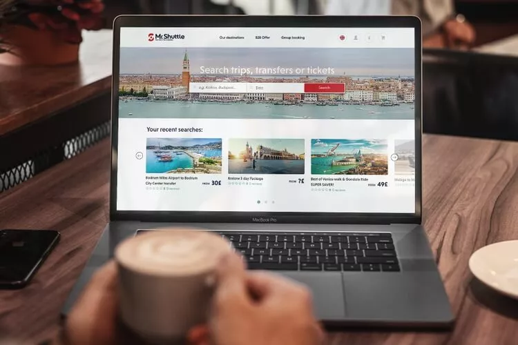
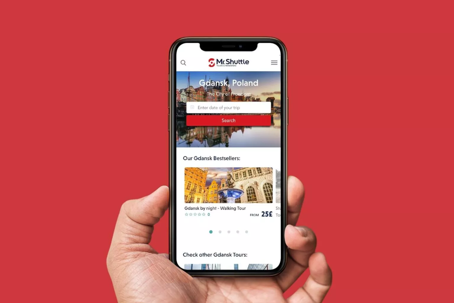
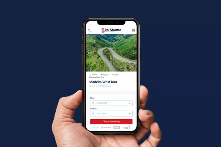
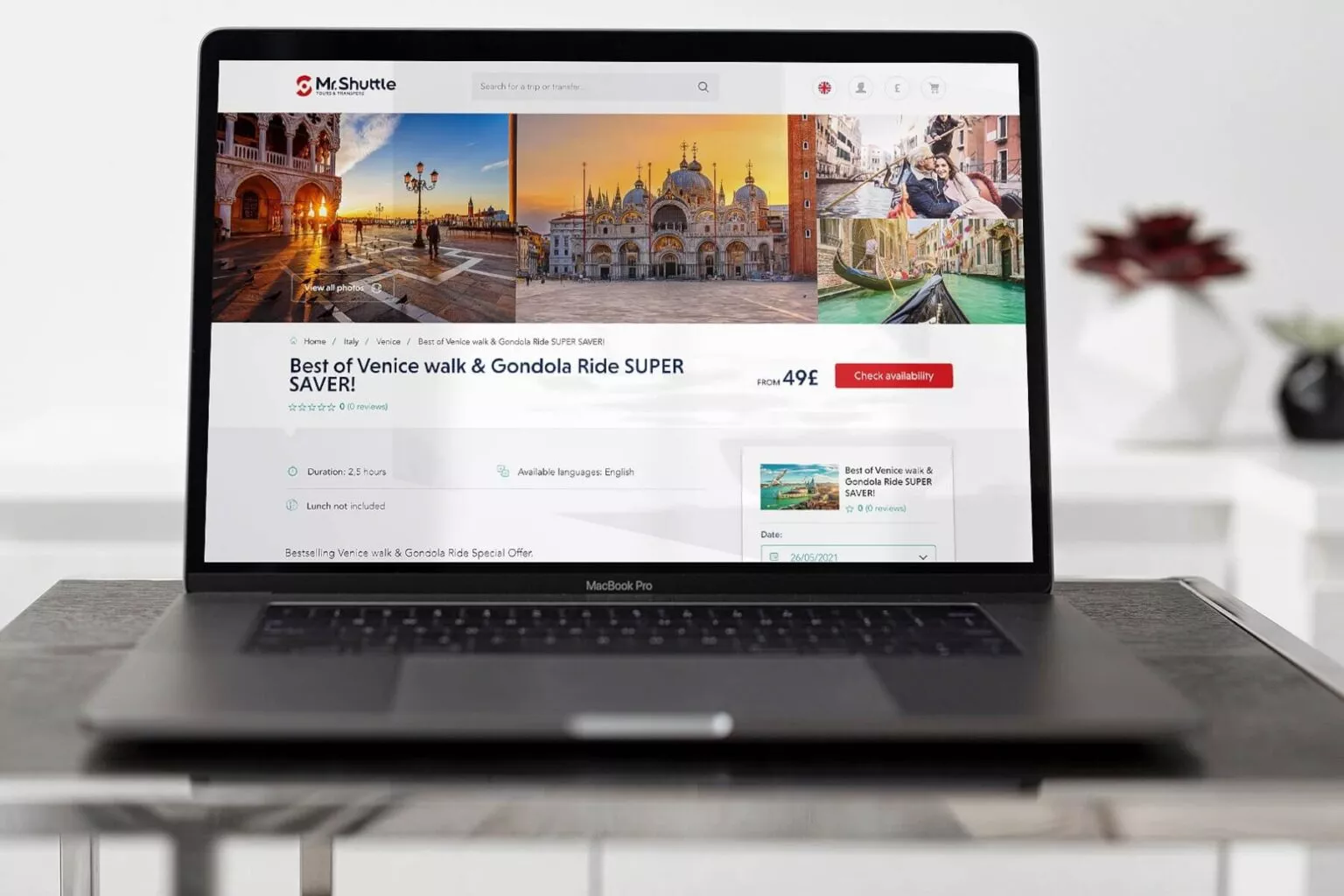
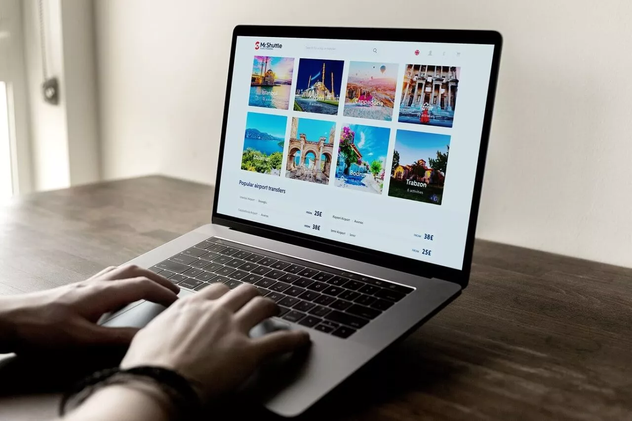
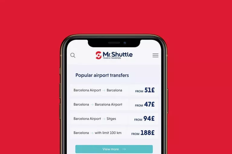
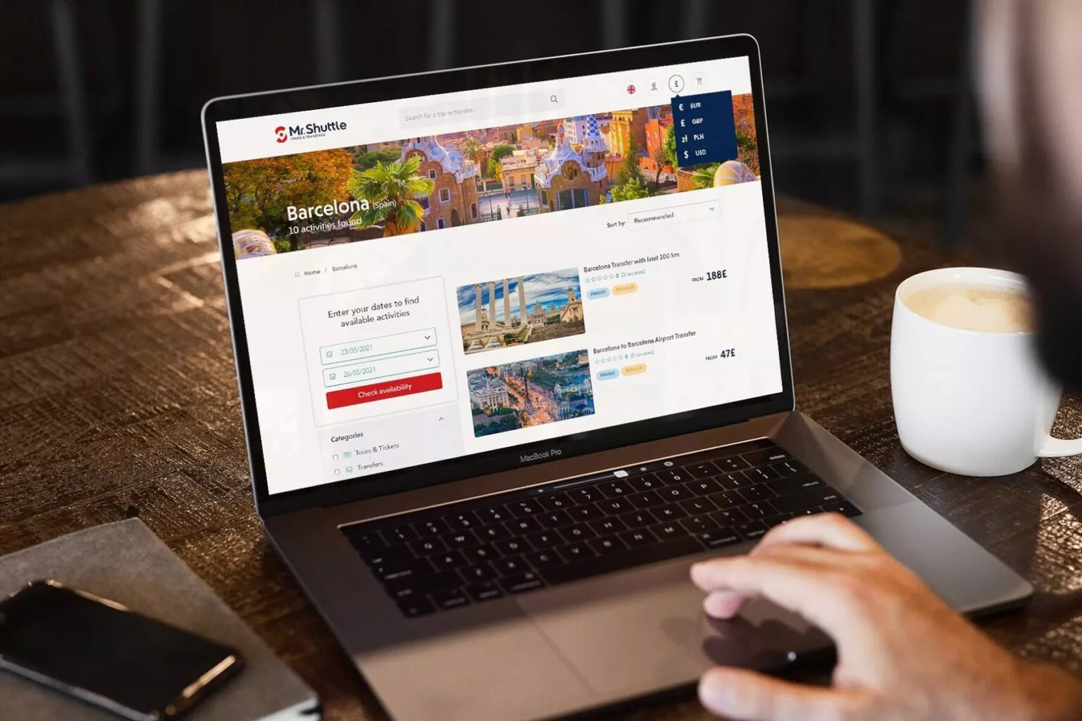
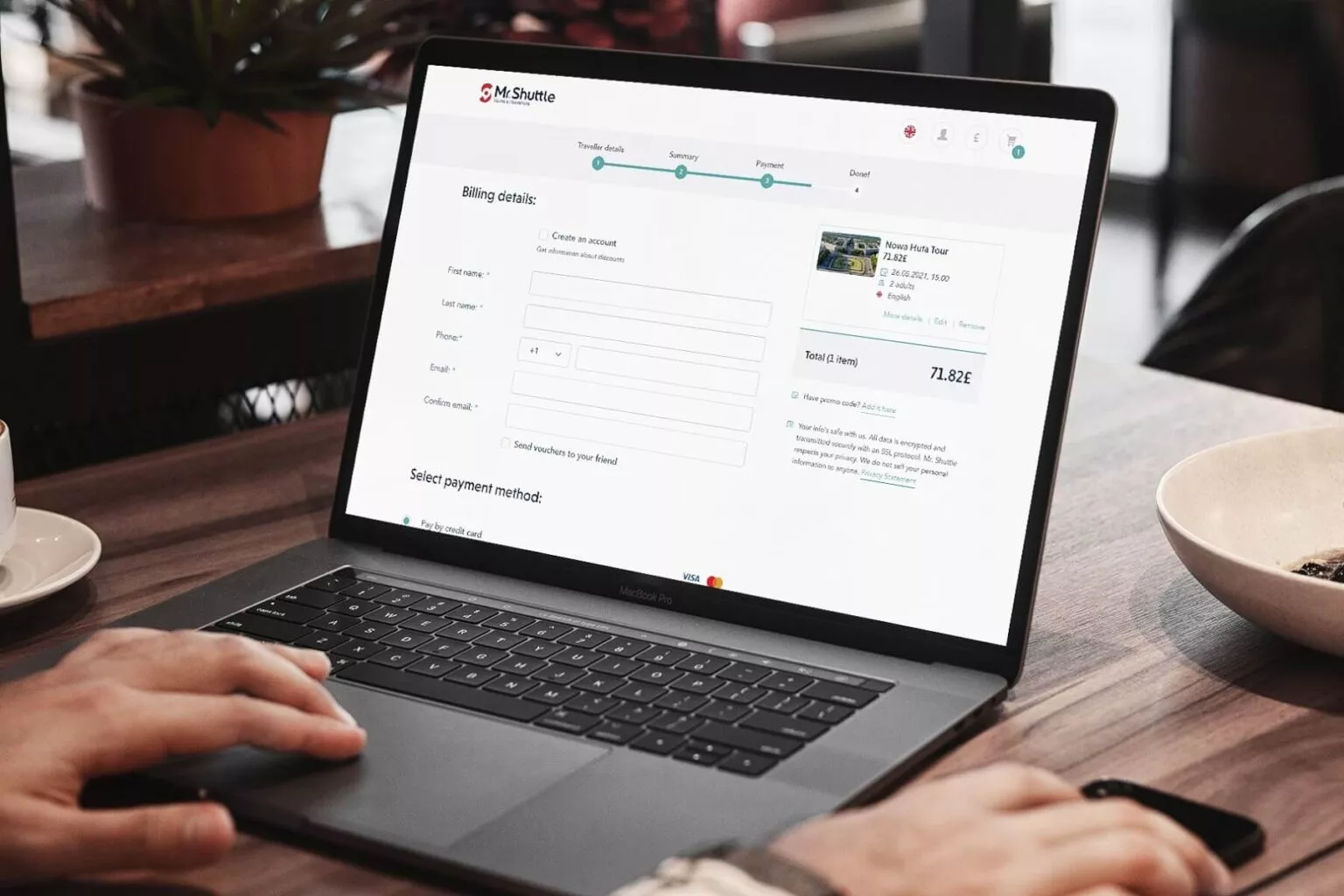
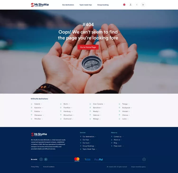
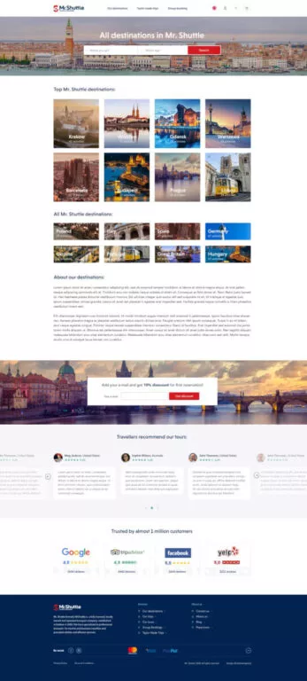
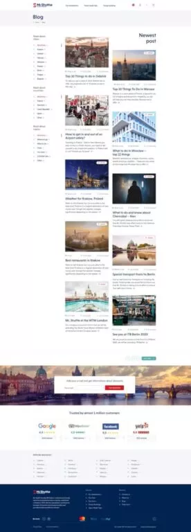
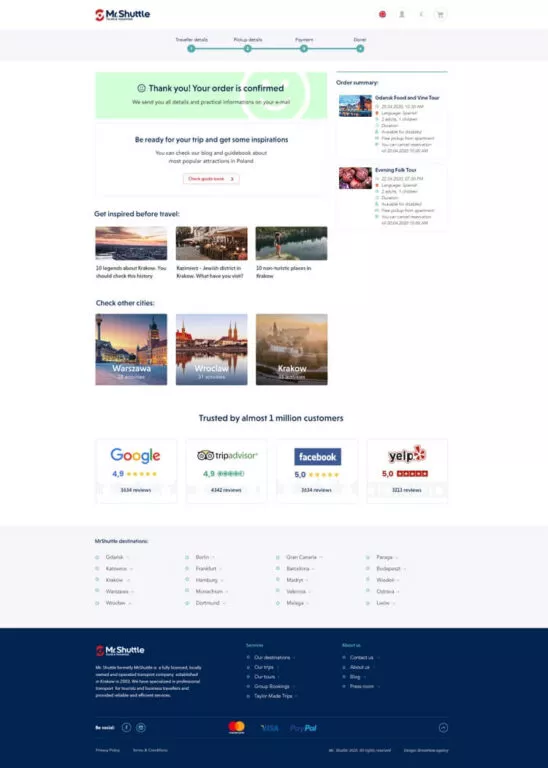
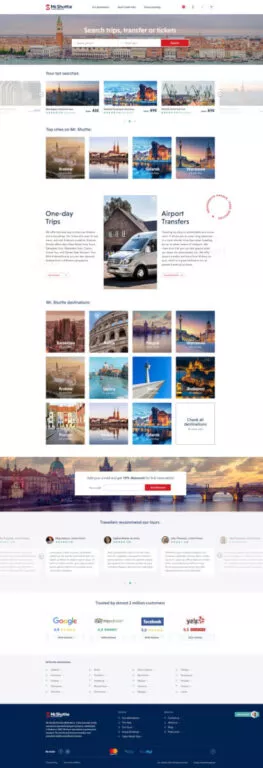
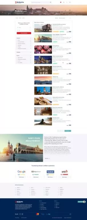
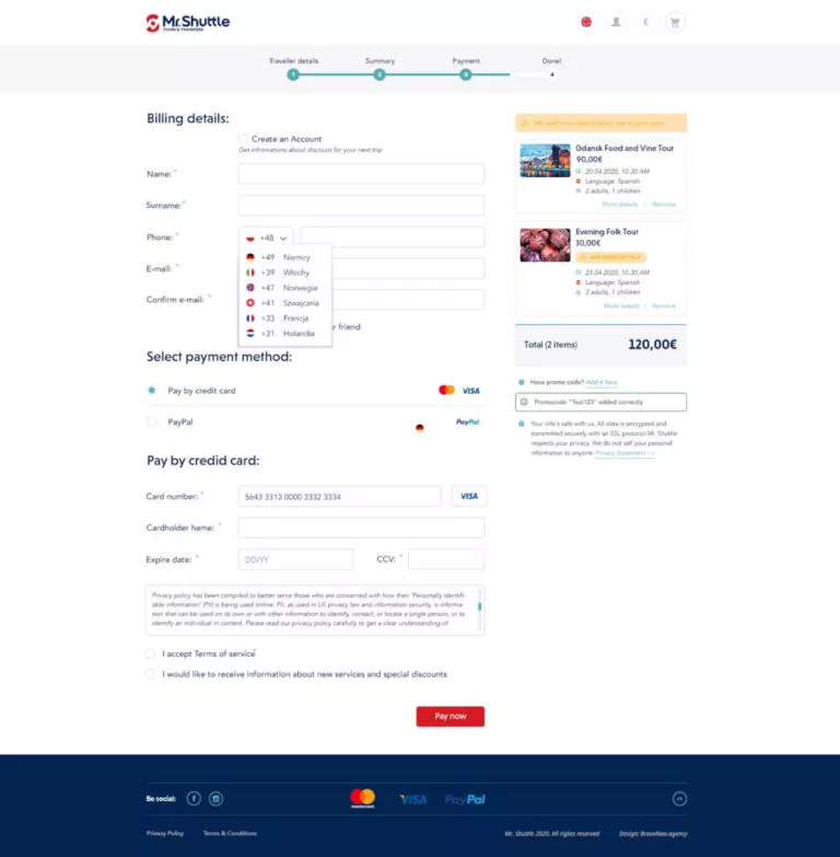
Our collaboration with Mr. Shuttle consisted of creating a completely new website that would allow people who love to travel on their own to book trips and transfers in a friendly way.
Brave New is the 2025 award-winning company in Poland for its WordPress, Web Development and E-commerce Development services

Phone +48 791 713 250
How we helped Mr. Shuttle create one of the best travel sites in the world
You can also follow us on social media:
Project in numbers and most important facts
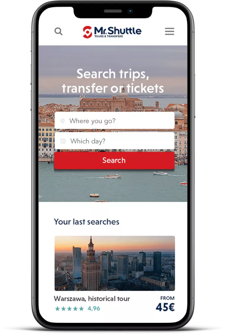
- Website design thought out in terms of user comfort, consisting of over 100 designs of desktop and mobile views. Detailed UX / UI analysis allowed us to create a website that is convenient and user-friendly.
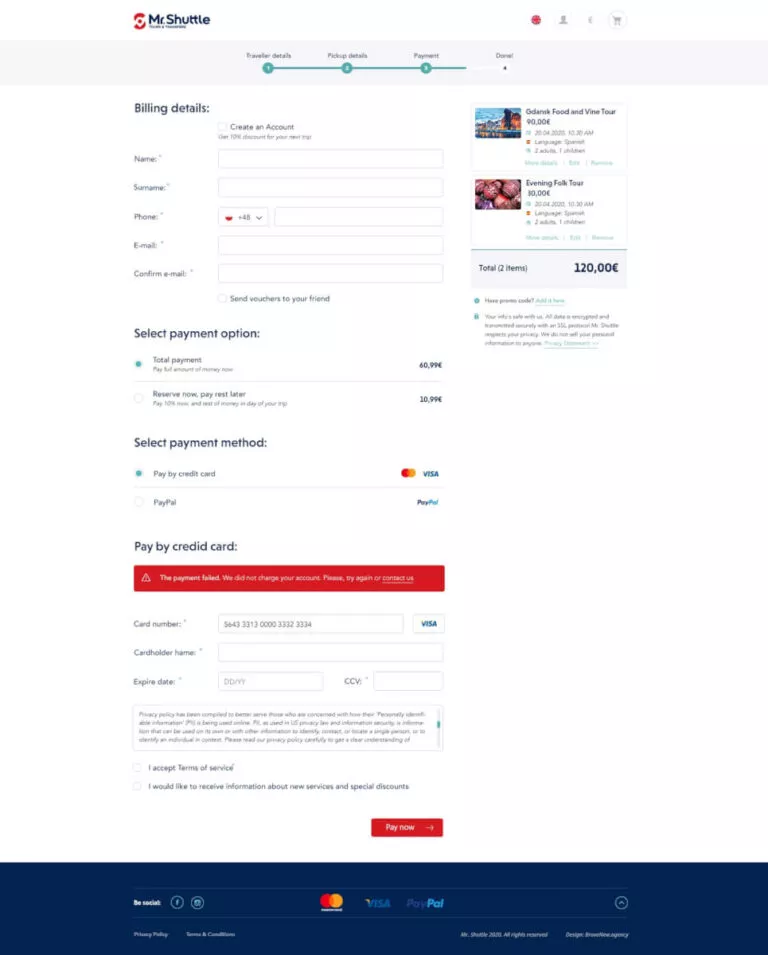
- A modern purchasing process, thanks to which the user can add many products to the cart and pay for all of them with one transfer. Most of these types of websites allow you to buy only one service. We managed to solve this problem.
- A combination of the WordPress platform with the proprietary tourist traffic management system, created by Mr. Shuttle. Thanks to this, Mr. Shuttle can conveniently manage services, ticketing and availability for each day.
- Connection with advanced analytics allowing effective collection of information about user behaviour. Thanks to tools like Hotjar, Google Analytics Enhanced Ecommerce, Klaviyo and Google Search Console, Mr. Shuttle can learn more about how customers use the service and thus develop it even better.
- In cooperation with the PromoTraffic marketing agency, we have introduced full optimization of the website in terms of SEO, thanks to which the traffic of users from the Google search engine has increased.
90/100 Website speed score in the Google speed test on computers
1500 Number of services available on the website
4 Number of available currencies in payments (euro, dollars, pounds, zlotys)
102 Number of designed desktop and mobile views
14 Number of countries, where Mr. Shuttle’s services are available
What was the challenge we faced?
Mr. Shuttle is a company that facilitates travel in several cities in Europe. Thanks to interesting trips and convenient transfers between cities, everyone can discover the world on their own. The company has been operating on the market for several years, successfully serving hundreds of customers every day. The time has come to create a booking service that will change the way the business continues.
We love travelling ourselves and have used similar services many times. Most of them, however, had many disadvantages. So we decided to create a website that we would like to use ourselves.
We love travels, therefore we decided to create a website for booking tripsthat we would like to use ourselves.
What was important to us?
Convenient and intuitive interface
Convenient and intuitive interface, thanks to which users will be eager to become customers. We have created a website where buying trips and transfers is a real pleasure.Easy administration
Currently, there are over 1,500 tours and transfers on the site. Managing available seats, dates and tickets must therefore be simple. By combining WordPress with the API of the PORT system, Mr. Shuttle can fully manage the tourist traffic in its system without having to duplicate the same work on the website.Emphasis on mobile devices
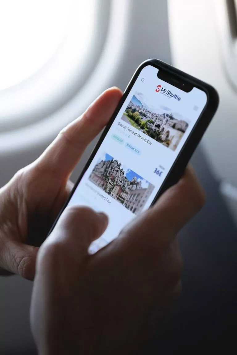
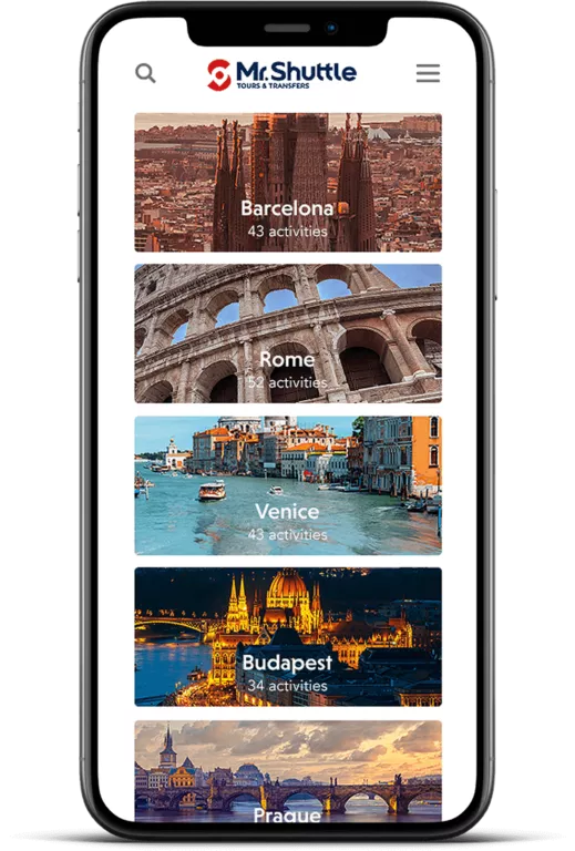
Each of the views was also designed for phones. We are aware that most users use the mobile version, which is why it was a priority for us from the very beginning.Tools for reselling trips and additional services
The sales process designed by us offers additional services to customers in a non-intrusive way. These are both suggested trips and transfers, but also, for example, additional lunch or luggage during the journey. The user can also conveniently review recently viewed services and return to those that are of interest to him.Data analytics
Thanks to tools such as Hotjar, Google Analytics Enhanced Ecommerce, Klaviyo and Google Search Console, Mr. Shuttle can learn more about how customers use the service and thus develop it even better.Modern sales process
Most of these types of websites (similar to airline websites) allow you to purchase one service at a time. We faced this problem and came up with a completely new approach to shopping. Thanks to this, our users can add many products to the cart and pay for them with one quick transfer.Various payment options
Users can pay in four currencies (Euro, dollars, pounds, zlotys) using MasterCard / VISA cards and PayPal.SEO optimization
In cooperation with the PromoTraffic marketing agency, we took care of website optimization and implementation of a strategy that increased traffic on the website from search engines.
In order to fully refine the website in terms of the convenience of use, we prepared over 100 desktop and mobile views.
Watch the video presentation
The Mr. Shuttle website is a convenient solution for independent travel enthusiasts – it makes it easy to book tours and transfers online.
To showcase the results of our work, we have also prepared a video presentation of the project.
How was the work going?
Implementation of the Mr. Shuttle has been one of the most interesting challenges in our company so far. From the beginning, we worked with the attitude that we are creating something unique.
The most important issues we put emphasis on are:
- Simple and intuitive website interface on mobile devices. Users often make reservations on the go, on mobile phones. We put emphasis on the convenience of use. Nobody wants to waste time on consecutive bookings when they can be sightseeing during that time!
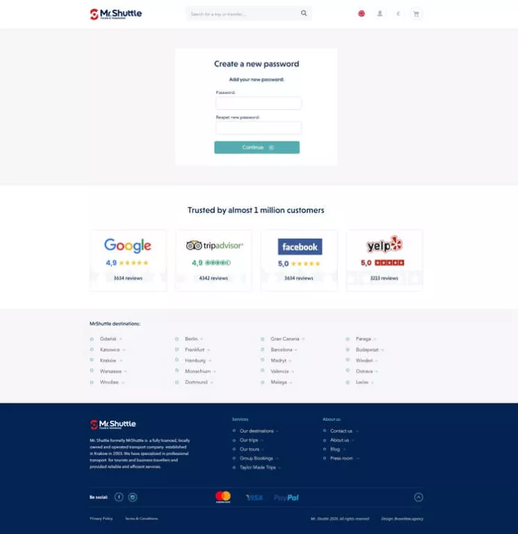
- Trust. This type of cruise service must be trusted from the very beginning. Users must feel that they are in safe hands and the tour or transfer purchased is of high quality. When designing the website, we exposed social proff. We devoted a lot of space to the opinions of satisfied customers or links to social media profiles, which prove the solidity of Mr. Shuttle.
- Transparency of offers and attractive graphics. We buy our dream journeys and trips with “our eyes”. Proper presentation of the photos was of great importance. However, we only make a purchase decision when we receive answers to all questions that bother us. That is why each of the offers, in addition to the photo gallery, has a section with a detailed description, departure schedule, frequently asked questions and the possibility of quick contact with an employee of Mr. Shuttle, when in doubt.
All of this made Mr. Shuttle a service that can fully compete with the largest competitors in the world.
Scope of work
- UX / UI design
- Web development
- API PORT integration
- Integration Payment gateway integration (Paypal, Mastercard, VISA)
- Analytics tools integration
- SEO optimization
- Innovative purchasing process
- Technical support after launching the website


