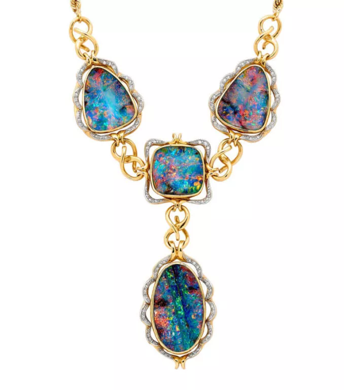
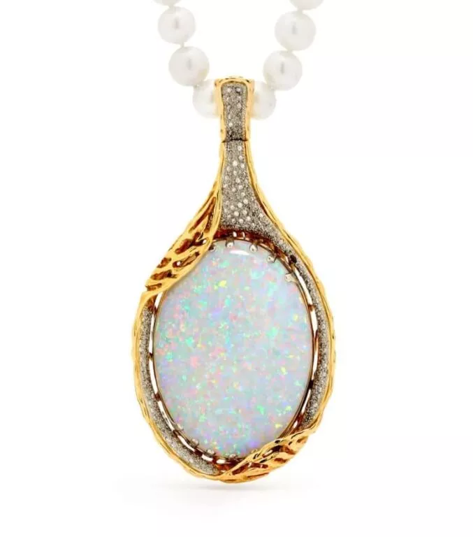
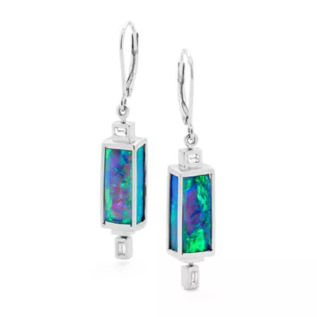
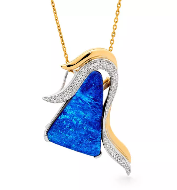
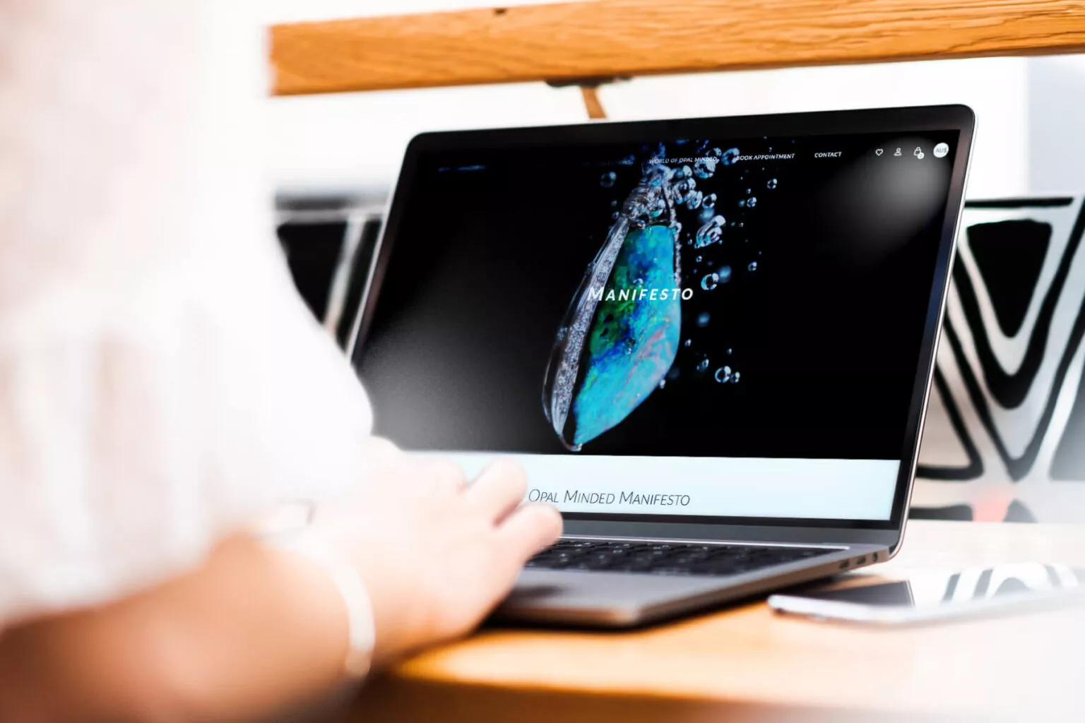
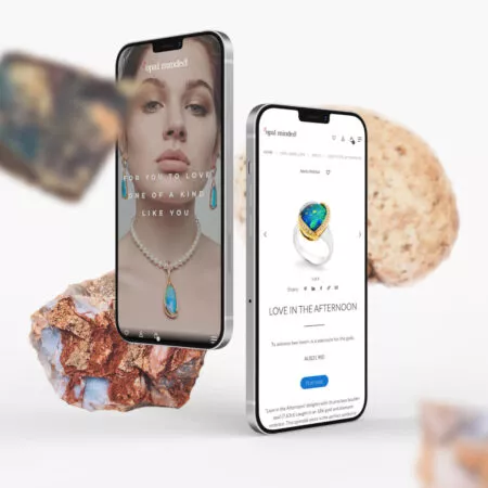
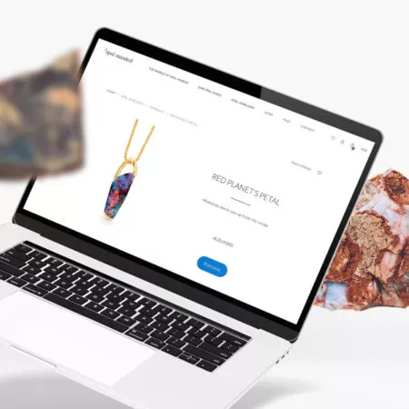
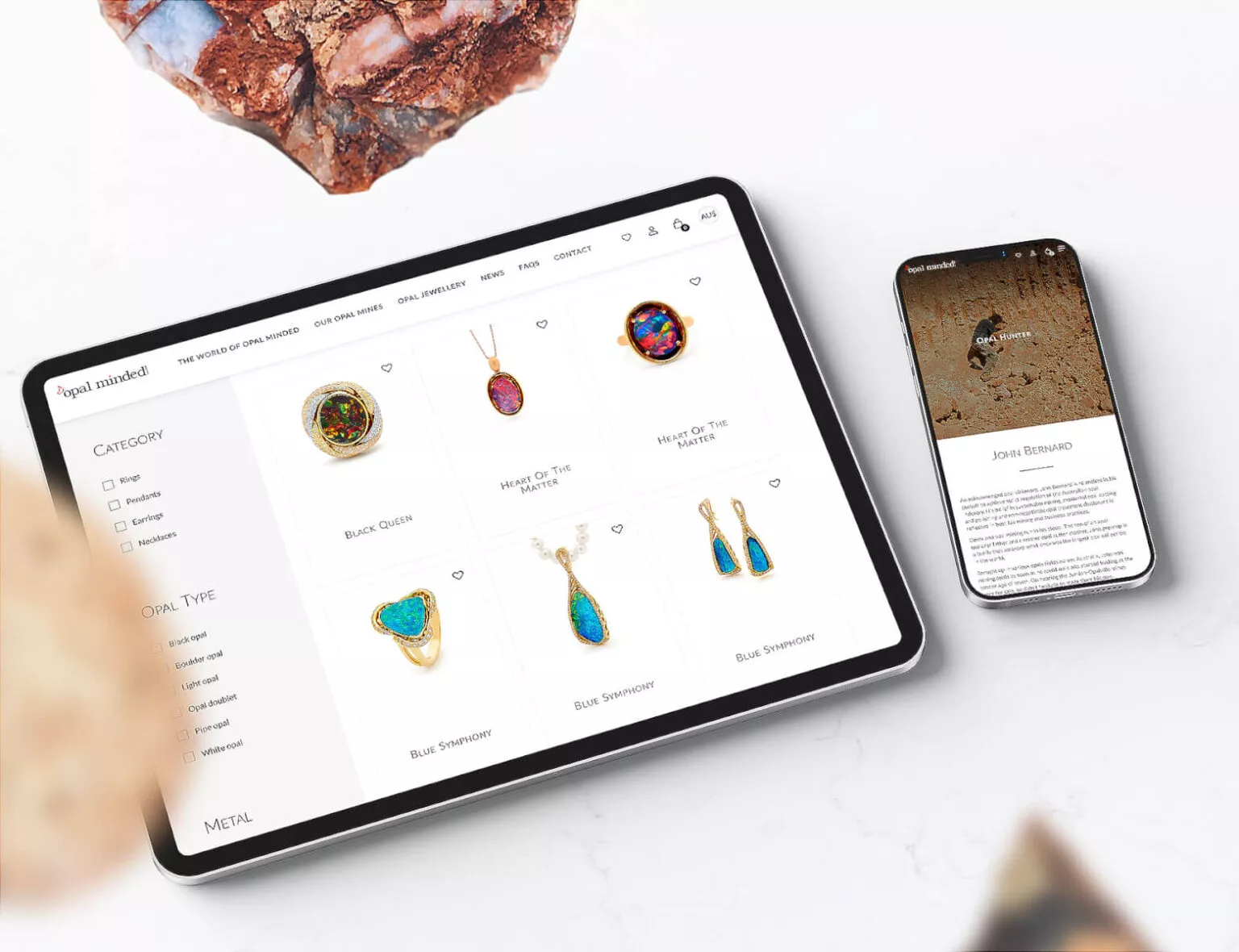
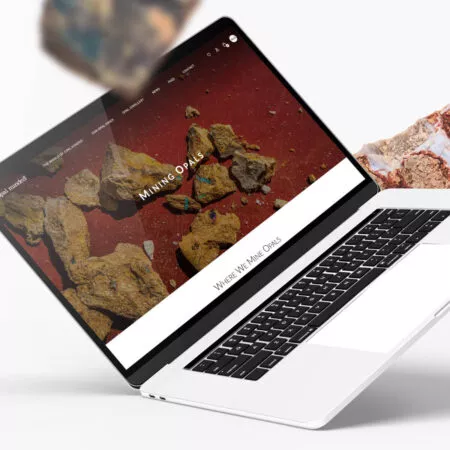
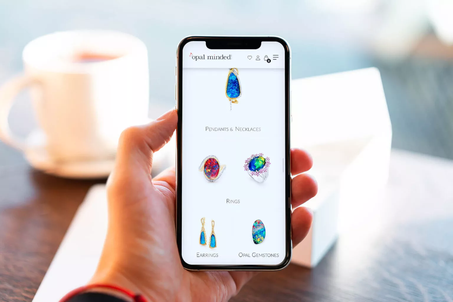
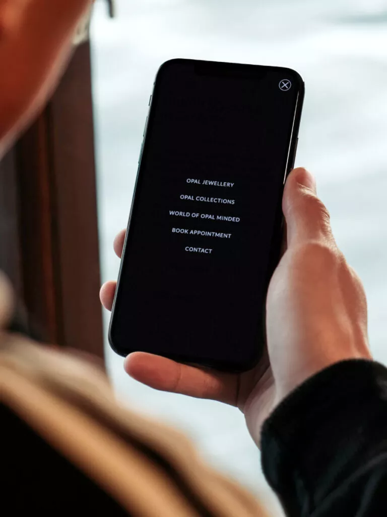
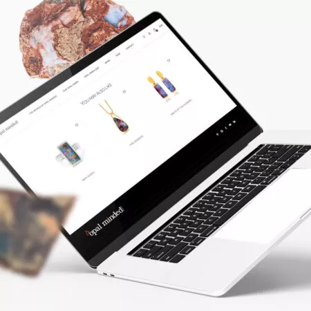
As part of cooperation with the Australian brand Opal Minded, we have created an online store with image elements. As a result, the company received tools to support sales and recognition in the network.
Brave New is the 2025 award-winning company in Poland for its WordPress, Web Development and E-commerce Development services

Phone +48 791 713 250
For Opal Minded, we have prepared an online store with premium products and a personalised purchase path

You can also follow us on social media:
The most important facts and figures
- The Opal Minded website is a great example of how flexible and personalized WooCommerce is. Using this administrative system, we have built a functional store that supports advertising activities and image building by the client.
- All subpages in the store are fully editable
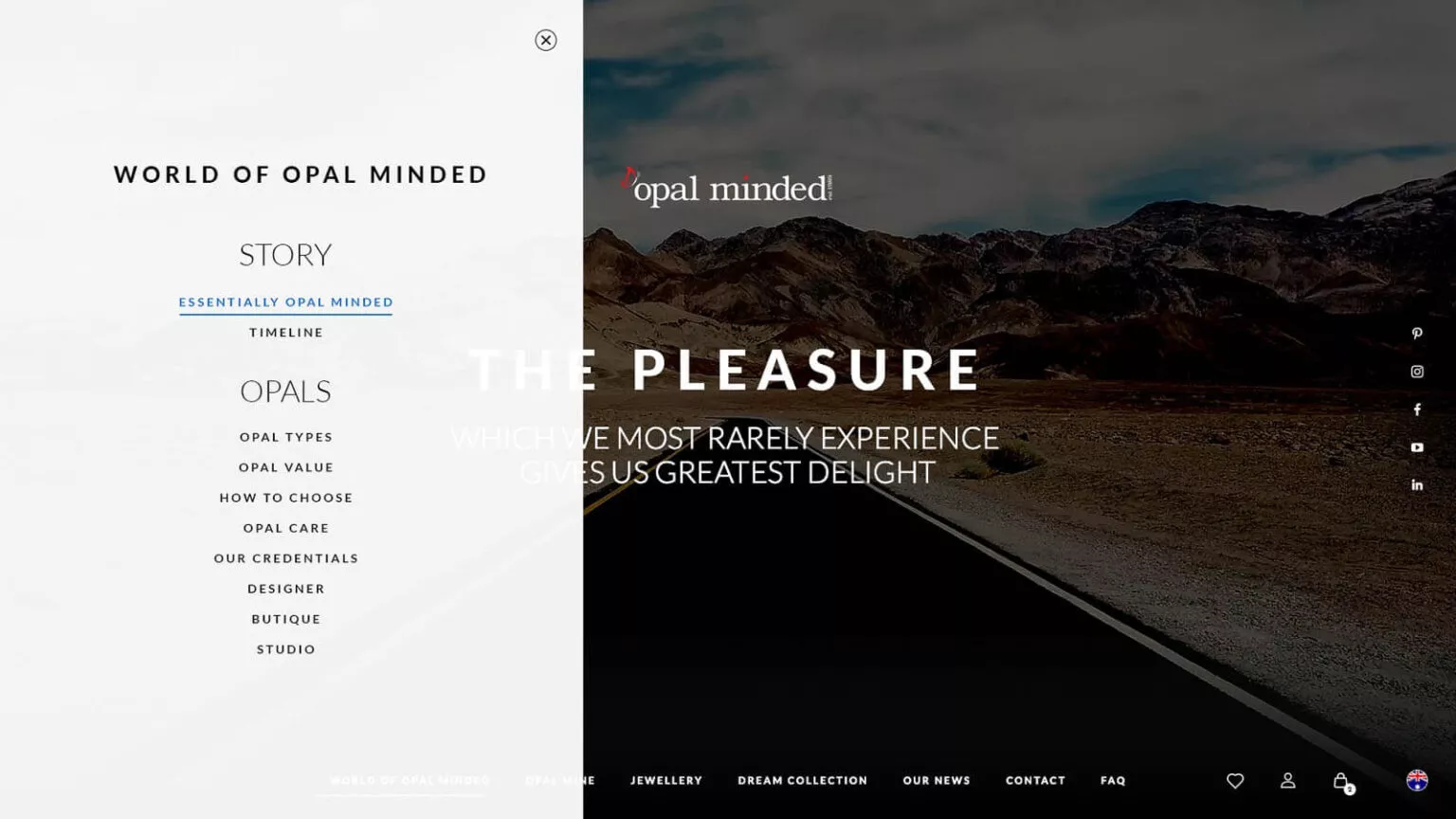
- As part of the work on the website, we have prepared a promotional video, which is included at the top of the home page
324 number of products available in the store
33 subpages made as part of the project
6 Number of available currencies in payments (Australian and US dollars, pounds, euros, Japanese yen and Chinese yuan)
The Client about the project
We have spoken to many companies, we have worked with many agencies and a few developers as well, but this is the first time in the history of this company that I’ve been really, utterly and absolutely satisfied with everything that came from Brave New.
Not only the quality of the website is fantastic but also the quality of the customer service and the responsiveness, the know-how - really unsurpassed. We have been serviced in a way that we have not been serviced by any other agency, small or large.In most companies, what we would experience is that there would be a person who would sign us up, we would get a lot of attention, at quite high intensity and involvement, but that would diminish as the project goes along. With Brave New, it is still power on, it’s fantastic - ongoing engagement and involvement.
I am absolutely full of praise. Do sign up with them, just don’t take them away from us, and you will be absolutely, amazingly satisfied. We can highly recommend Brave New, they are absolutely perfect. So, thank you and good luck!


Main assumptions and beginning of the project
The main assumption of the project was to create an unusual place on the web – a personalised store that would reflect the nature of Opal Minded’s business, interest customers and encourage them to buy opals – extremely rare precious stones.
Opal Minded is a company that extracts, processes and sells opals – unique precious stones. There are no two identical opals in nature, which makes them even more remarkable wonders of nature. These features were to be reflected in the online store. The Opal Minded store and website were intended not only to increase sales results but also to reflect the character of the brand and help users get to know these precious stones more.
Opal Minded did not sell via the Internet before. In the previous version of the page, products were only displayed but not available for purchase. Therefore, our task was not only to design and code but also to advise on the operation of the store and the selection of the best solutions.
It is a great pleasure to create a webshop with such unique products designed by Renata Bernard
What was important to us?
Personalised purchase path
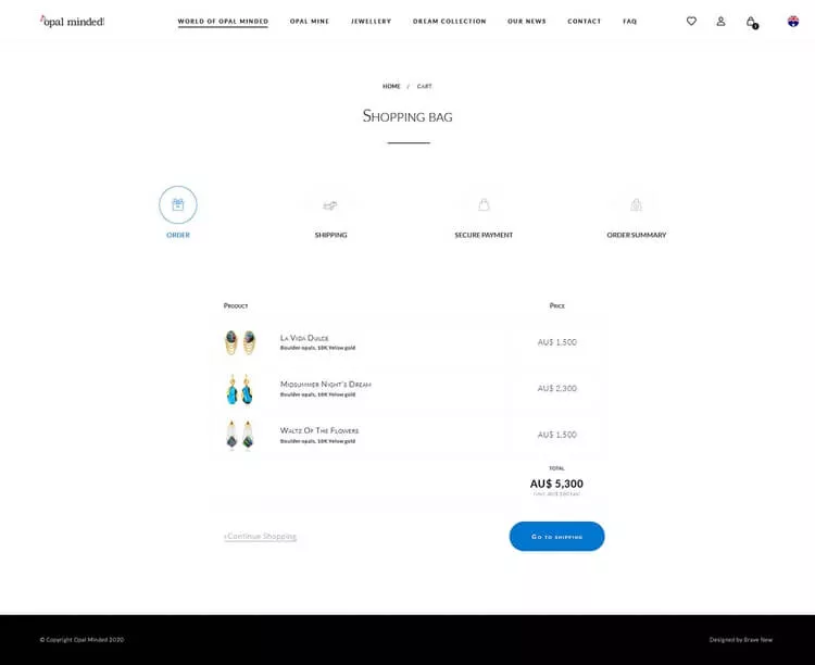
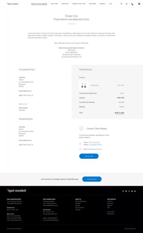
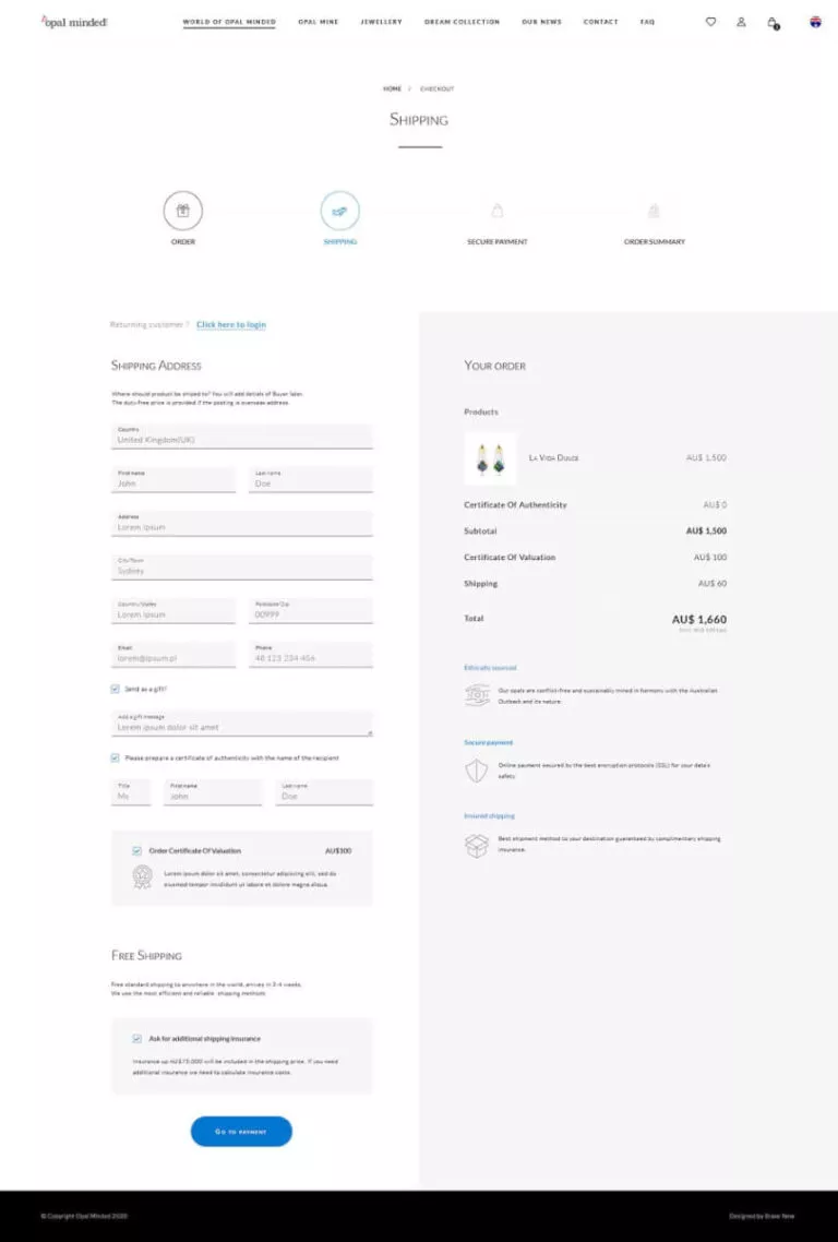
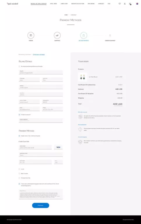
We've completely rebuilt the standard checkout path that is available in WooCommerce. The purchase process has been divided into 3 stages (instead of the standard two), and card payment is possible directly on the store's website. During the process, the user can select additional certificates, the cost of which is automatically updated in the order summary.
As part of the work, we introduced additional anti-fraud protections that support transaction and user safety
Managing product options
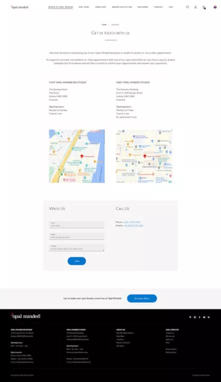
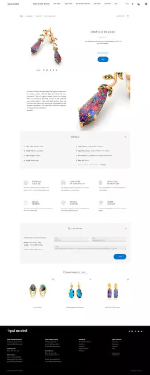
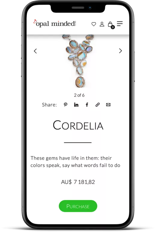
The product page has been built on the basis of an original template, and the administrator and the user have been given additional options for working with the product. The admin can choose whether the price of the product is to be visible or hidden. They can also disable the possibility of selling the product and redirect the user to the contact form. Each form is marked with a unique ID. Thanks to this, you can easily link the customer's inquiry with a specific product.Filtering products
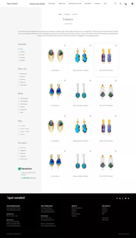
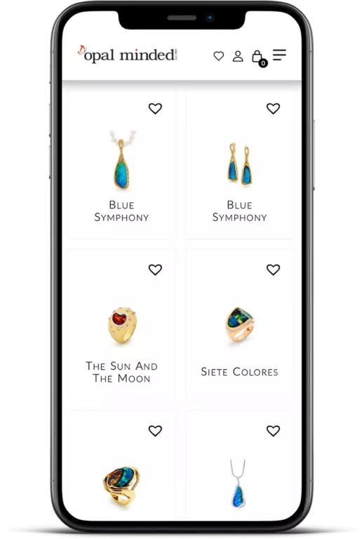
Displaying products available in the store can be narrowed down thanks to the available filters. What is worth noting is that the filters have additional descriptions to support positioning. Descriptions do not overlap and change depending on the selected settings.Personalised My Account page
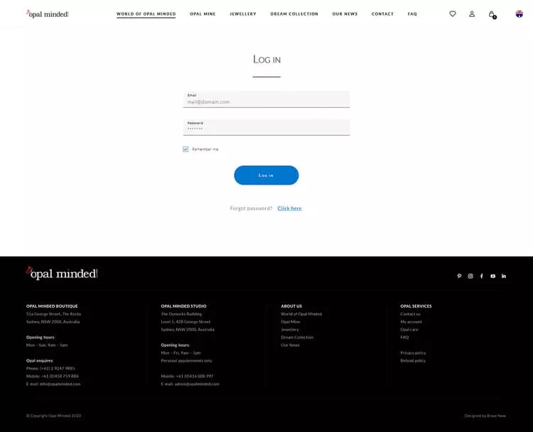
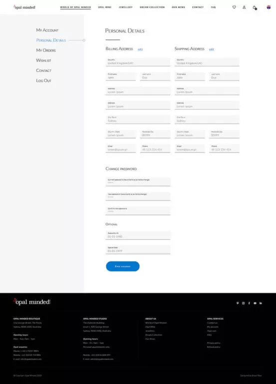
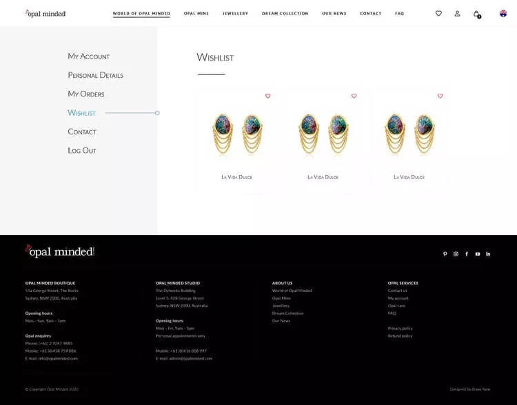
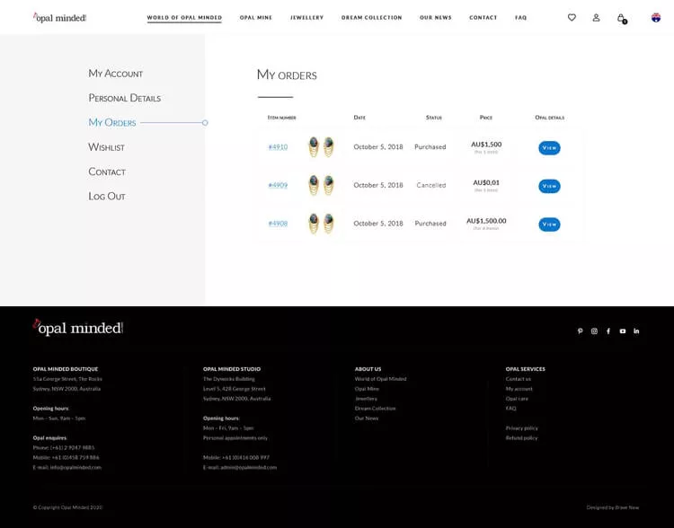
My Account page has also been redesigned. In the Opal Minded store, it is the Event Center, where the user will find not only information about orders but also recommended jewellery or news from the company's life. The logged-in customer also has the access to the list of their favourite products.Editable subpage templates with creator function
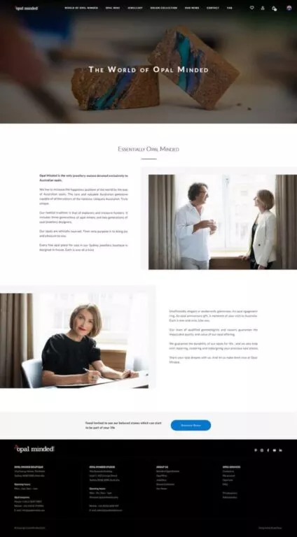
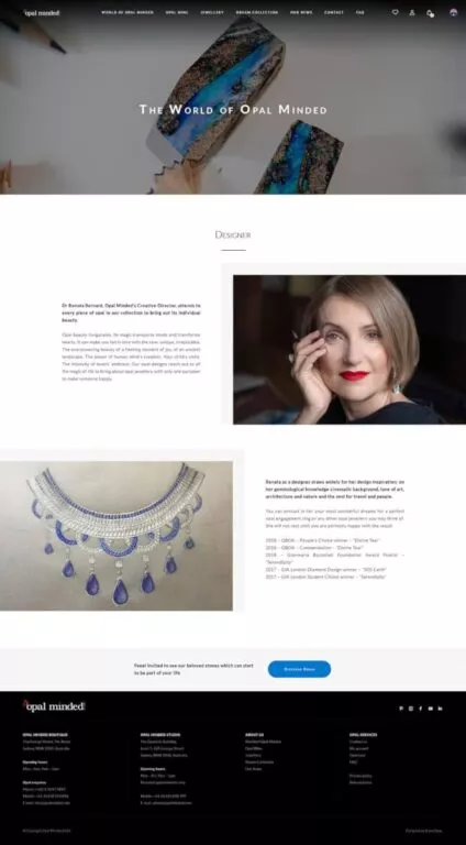
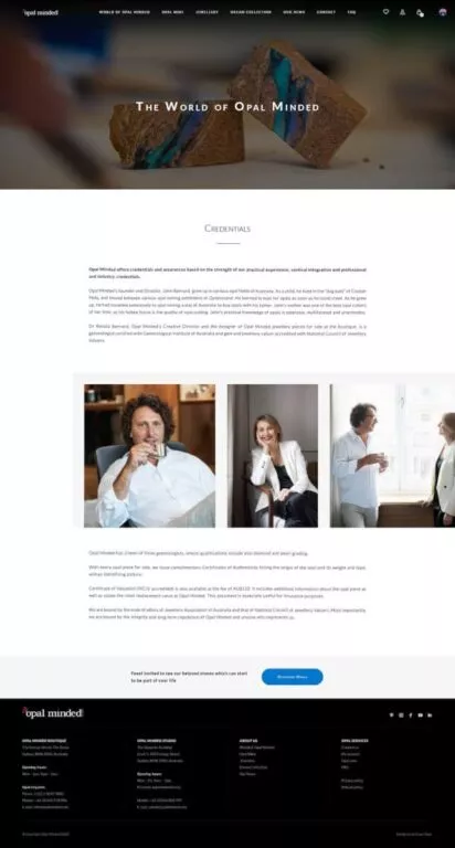
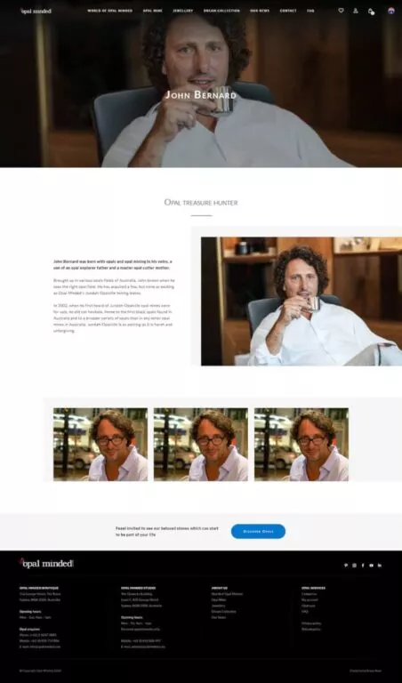
All subpages in the store are fully editable. The admin can modify the titles, content and photos. The creator function built on the basis of the ACF Pro plug is also important. The administrator can add new blocks to each subpage, e.g. text, gallery or text with a photo on the left or right side.Multiple Currencies
The store allows you to display prices in 6 currencies: Australian and US dollars, pounds, euros, Japanese yen and Chinese yuan. Prices are automatically converted according to the set exchange rate. The payment service itself takes place via an external operator - Braintree.Promotional video at the top of the website
As part of the work on the website, we have prepared a promotional video, which is included at the top of the home page. The film was made based on the script and materials provided by Opal Minded. The video was created in a version adapted to mobile devices and wide screens.
The Client about the project
In the video beside you can see how dr Renata Bernad - the Creative Director of Opal Minded talks about the creative process and what she says about our work. We take pride in carrying out a project with a parter such as Opal Minded.
What was the work on the project like?
A magical place - this message was repeated many times by the owner of Opal Minded, Renata Bernad. For us, it was a clear indication of the direction in which the work should go.
There are several time zones between Krakow and Sydney. Nevertheless, we knew from the very beginning that regular meetings and discussions about our graphic concepts would be very important. Therefore, primarily in the first and last phase of the project, we adjusted our calendars to match the working hours in Sydney. We were extremely excited about it. We have experience working in different time zones and we were glad to be able to use them once again.
We started the work with conceptual activities. We have prepared a set of UX mockups for product pages and several graphic concepts for the home page. Together with Renata and Marta, we decided that the home page should have an atmospheric video that would reflect the character of the brand.
It took us several weeks to develop the final graphic concept for the entire website. As part of the work, over 50 prototypes and graphic designs were created, which were not only to look good but also to encourage the customer to interact and purchase.
When the works on the subpages of My Account were still underway, we started coding the website.
The Opal Minded online store has been equipped with non-standard functions. We knew our ideas would require expanding and rewriting many of the default features that WordPress and WooCommerce offer. The biggest challenge was to ensure an appropriate level of security in the store, which required numerous consultations with the team of the provider of the quick payment gateway – BrainTree.
Thanks to mutual understanding and close contact, after several months of hard work, the Opal Minded website was ready. Since its launch, the store has undergone numerous changes: the home page has been equipped with new functionalities, and we have made a sort option available on the product list. Product prices and availability have changed, and the first customers have placed orders. We are glad that we are constantly working on project development and introducing new solutions that are attractive to Opal Minded customers.
Scope of work
- UX / UI
- Webdesign
- Creating a personalized product page and My Account
- Website and e-store coding
- Creating a personalized sales process
- Promotional video
- Integration of quick payments
- Technical support after the launch of the website
