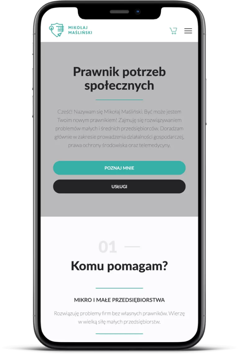
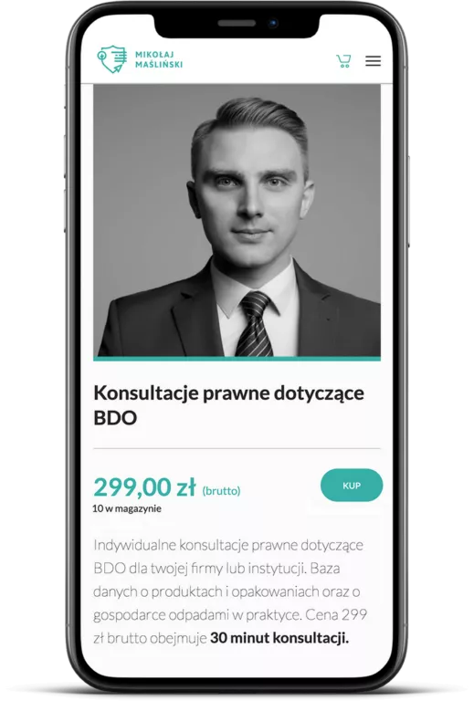
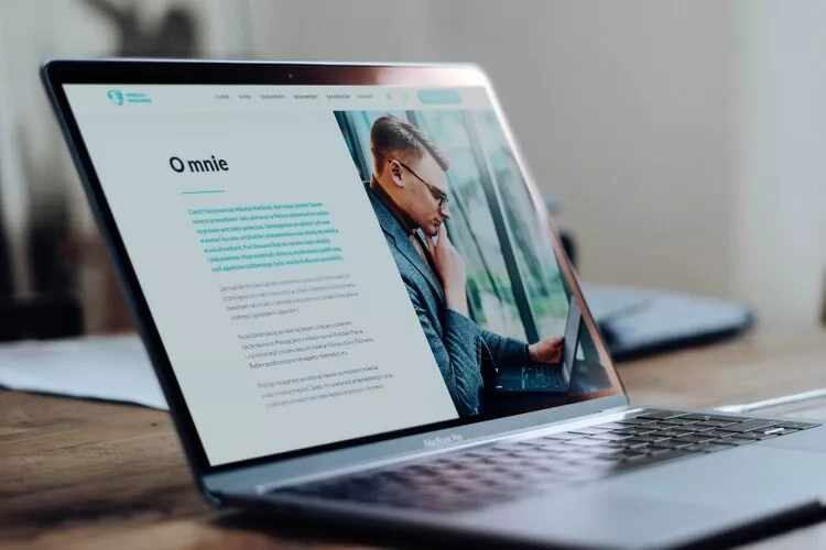
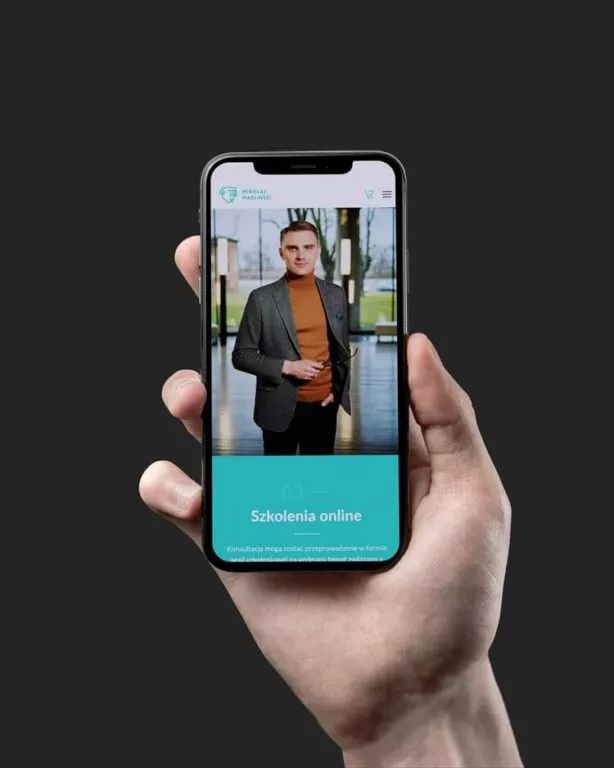
We created a website and online shop for a lawyer. The project has paid for itself after 6 months of the shop’s activity!

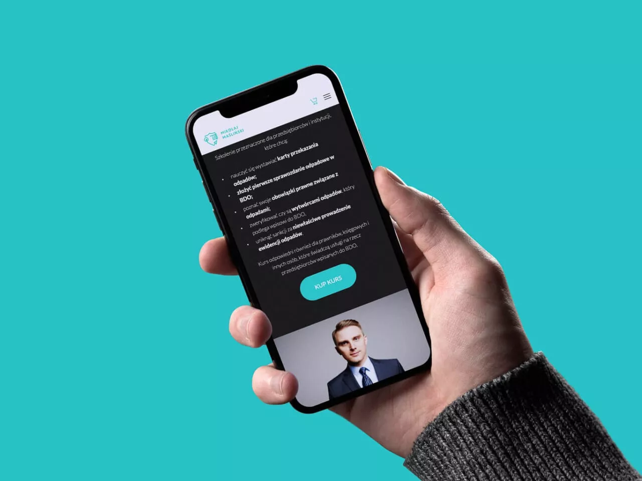
Wizualizacja strony logowania na telefonie

Śledź nas w mediach społecznościowych:

mikolaj maslinski logo

Mikołaj Maśliński is a social needs lawyer. Mikołaj helps small and medium-sized enterprises solve problems, especially in the field of business, telemedicine and environmental protection.

The main objective of the project was to create a platform where entrepreneurs can find legal advice and products tailored to their current needs.

Check online
Administrowanie stronami internetowymi - wizualizacja przycisków na stronie internetowej

Project in numbers and most important facts

  • We have prepared a simple landing page wizard for Mikołaj, which allows to prepare professional projects without the knowledge of HTML/CSS code
  • Attractive shopping module with a basket extending from the right side of the screen
  • The site is extremely light and functional
  • 95/100

    points in Google mobile tests at the time the site was delivered

  • 98/100

    in Google desktop tests at the time the page was delivered

  • +1500

    website visits in the first week of operation

The Client about the project

I’m the owner of a law company. We deliver legal advices, courses and legal documents templates for entrepreneurs.

The main idea of our company was to deliver courses, services and legal advices for entrepreneurs via Internet. To realise this idea we ask BraveNew to provide website which join tree main services: online shop, online course platform and classical blog.

After launching our site we got a lot of positive feedback from friends and clients. After 6 months of website launching, it is profitable and deliver all planed functionalities. It’s one of the best investment in my life. I’m totally proud of this website.

They provided clear communication and they were results-oriented. We used mainly e-mail communication as well as tele and videoconferences with team members.

Mikolaj Maśliński

Lawyer

mikołaj maślińsk logo
Tworzenie sklepów internetowych - mężczyzna przeglądający stronę internetową

Main assumptions and beginning of the project

We wanted to create a professional service that would present Mikołaj as an expert, but also a friend to whom you can turn to for advice. In this regard, tips from the Blend PR agency and Magdalena Gajek, who is responsible for media communication of Mikołaj Maśliński, have been helpful. The provided texts, visual identification guidelines and, above all, professional photographs allowed us to get down to work efficiently.

What was important for us?

  • Landing page wizard

    We have prepared a simple landing page wizard for Mikołaj, which allows to prepare professional projects without the knowledge of HTML/CSS code. Templates prepared by us allow to add content, photos and links, which significantly shortens the time of work on such a site. What is important, the subpages created in this way are also perfectly optimized.
  • Sales of courses and products

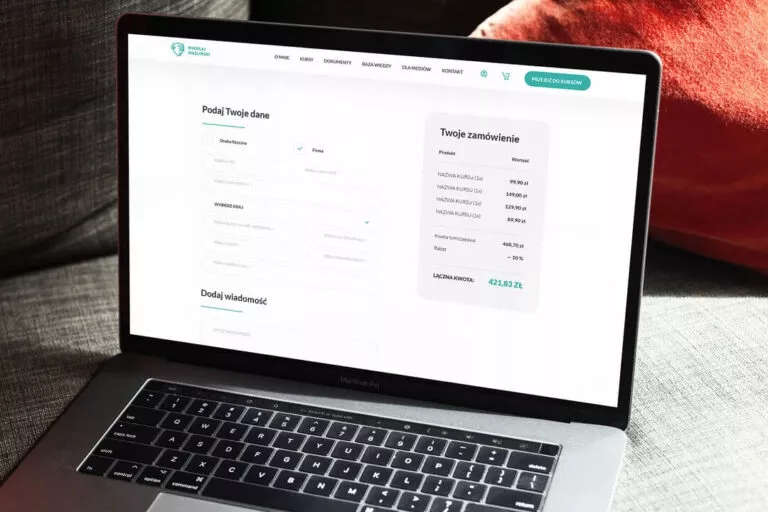
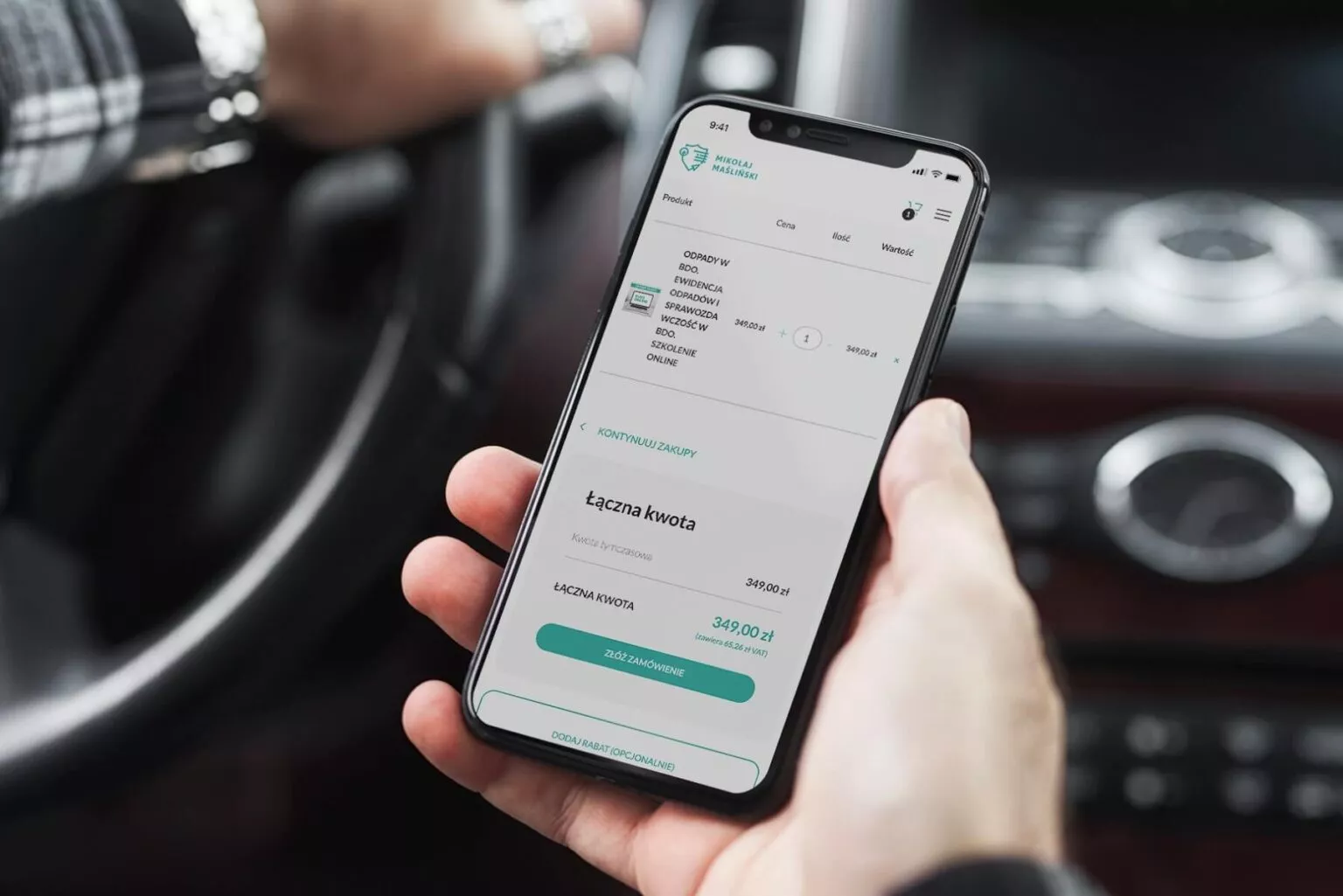
    The website has been equipped with an attractive shopping module with a basket extending from the right side of the screen. The user can already manage the ordered products on this screen, remove unwanted ones and see their total price.
  • Functionality and lightness

    The site is extremely light and functional. Such an effect was achieved not only due to very good script optimization, but also because of Mikołaj's approach to the project. The most important element of the website is the content available to the user.
Web design - wizualizacja oferty na stronie internetowej
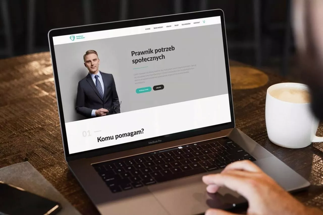
  • Zdjęcie laptopa z wyświetloną stroną internetową
  • Wizualizacja strony mobilnej
  • Wizualizacja strony z listą na telefonie
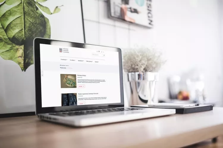
  • Zdjęcie laptopa ze stronę główną
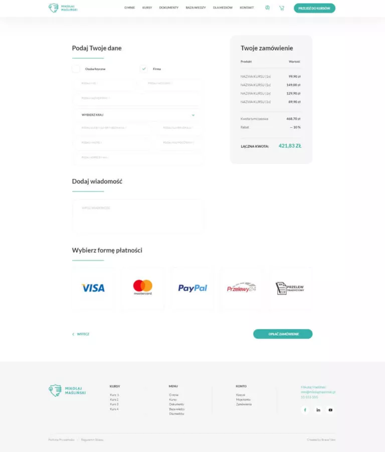
  • Wizualizacja procesu zamówienia na stronie WWW
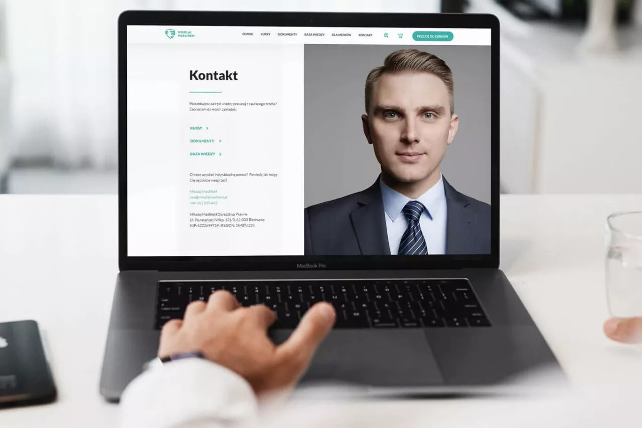
  • Wizualizacja strony kontaktowej w wersji deskoptowej
  • Wizualizacja strony logowania na telefonie

What was the work on the project like?

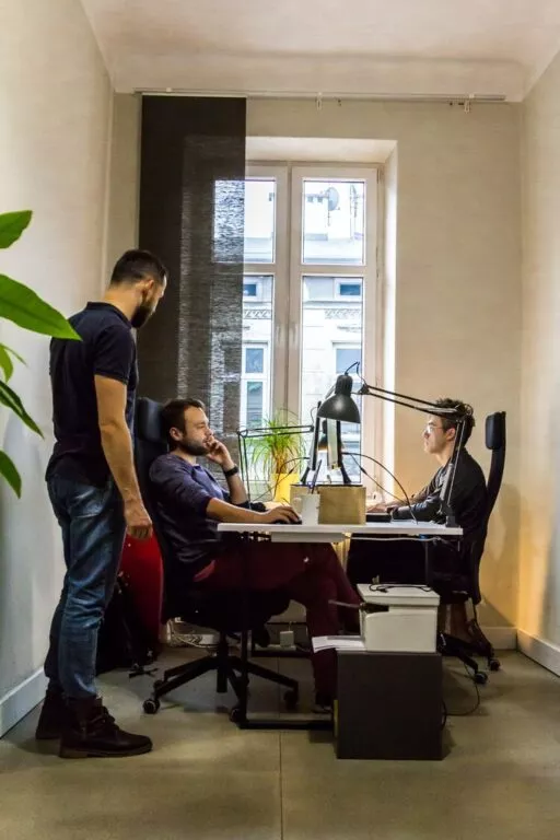
Web development - praca programistów nad stronami internetowymi

After receiving texts and guidelines related to the colour of the page, we prepared functional mock-ups on which we presented the architecture of the content of the main page. Because the other subpages of this project are relatively short, we immediately went to the design phase. After the approval of the homepage design we worked on subpages. Later in the work, when we started coding the project, an additional landing page project was prepared, designed to be the basis for the landing page creator.

When the website project was completed, we started to integrate with the exchange rate platform, marketing tools and fast payment gateway. Thanks to the commitment of the whole team, Mikołaj received a functional and transparent project, which became his online command center.

Scope of work

  • Webdesign
  • Website coding
  • Store configuration
  • Creating a Landing Page Wizard
  • Adding content
  • Technical support after the service has started

We created a useful interface, which is consistent with the created visual identification

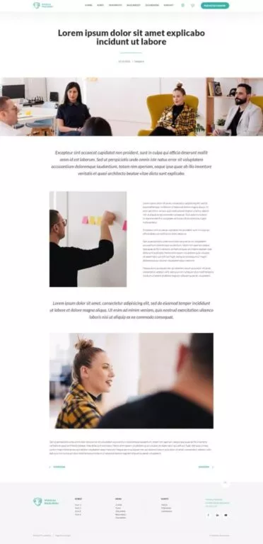
  • Zrzut ekranu strony z przykładowym wpisem
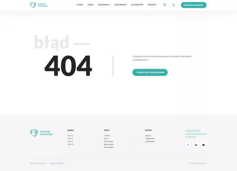
  • Zrzut ekranu strony błędu 404
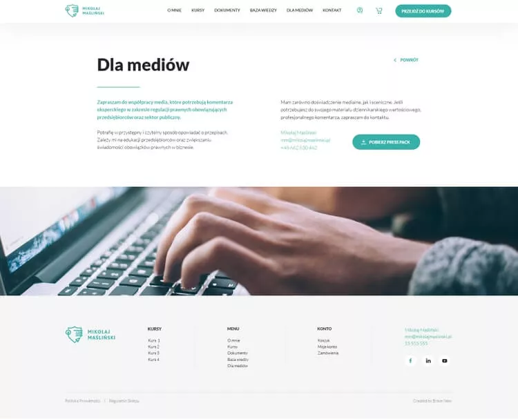
  • Zrzut ekranu strony wraz z nawigacją i stopką
  • Wizualizacja witryny na laptopie
  • Zrzut ekranu strony postu z komentarzami
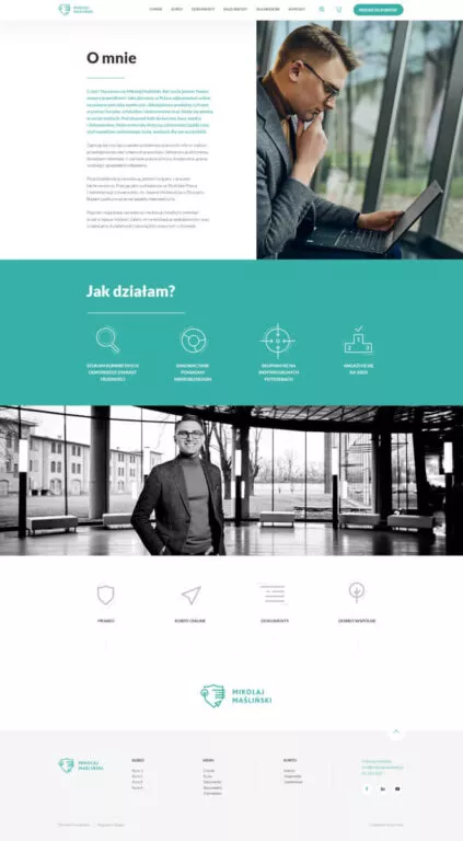
  • Zrzut ekranu strony z informacjami
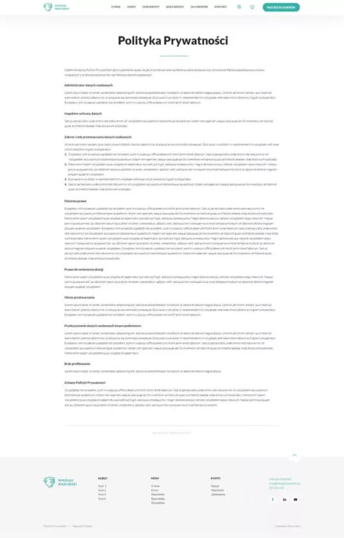
  • Zrzut ekranu strony Polityka Prywtaności
  • Zrzut ekranu strony internetowej z formularzem zamówienia

Project team

  • Andrzej Kozdęba

    Project manager

  • Maciej Rumiński

    Web developer

  • Patrycja Michno

    UX / UI designer