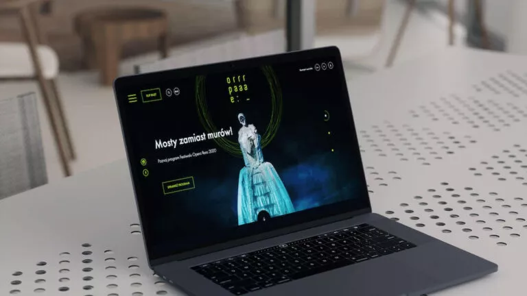
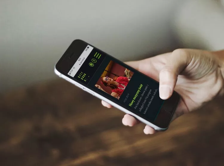
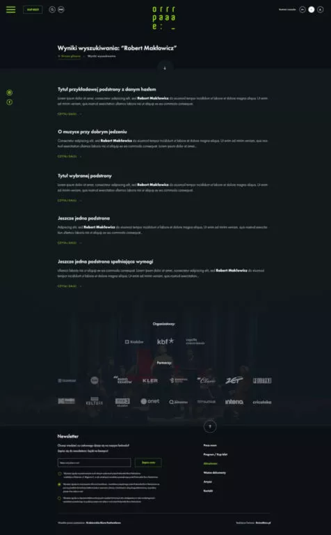
The opera festival Opera Rara faced the problem of a non-intuitive website. Users quickly left the site because they could not find the information they needed. Our task was to create a new, readable and functional website with facilities for people with disabilities.
Brave New is the 2025 award-winning company in Poland for its WordPress, Web Development and E-commerce Development services

Phone +48 791 713 250
How we have provided improvements for the disabled and prepared a refreshed design, following UX rules, equipped with an intuitive calendar.

You can also follow us on social media:
About project
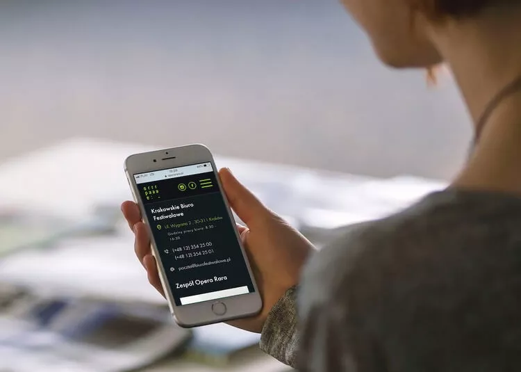
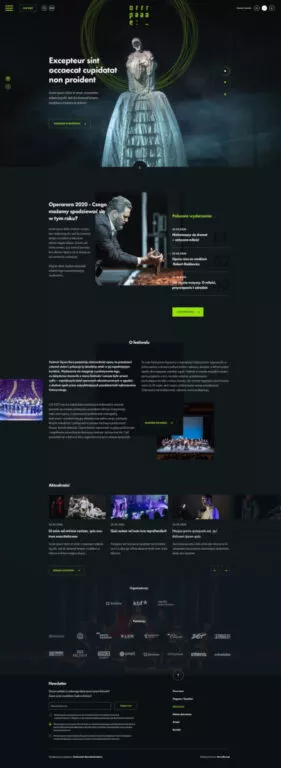
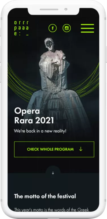
Opera Rara is an opera festival that shows the diversity and uniqueness of this musical genre. Fun, participation, creative expression and the position of the Opera House as a brand and centre of social life were the main guidelines when creating a website design.
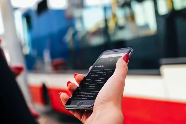
The main goal of the project was to create an original design, which will be not only visually attractive, but above all useful and easy to use for all users of the site
The site we designed was awarded in the competition at Csswinner.com
Main assumptions and beginning of the project
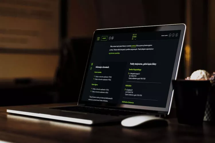
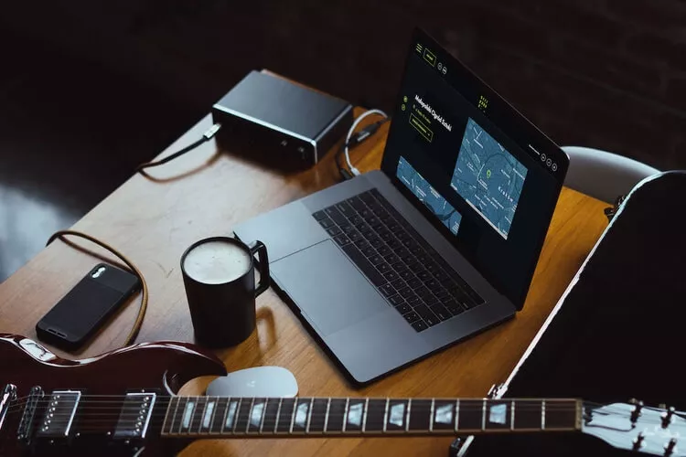
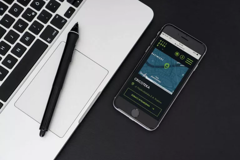
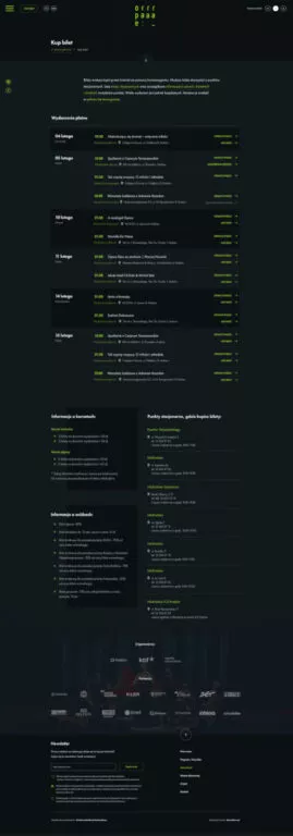
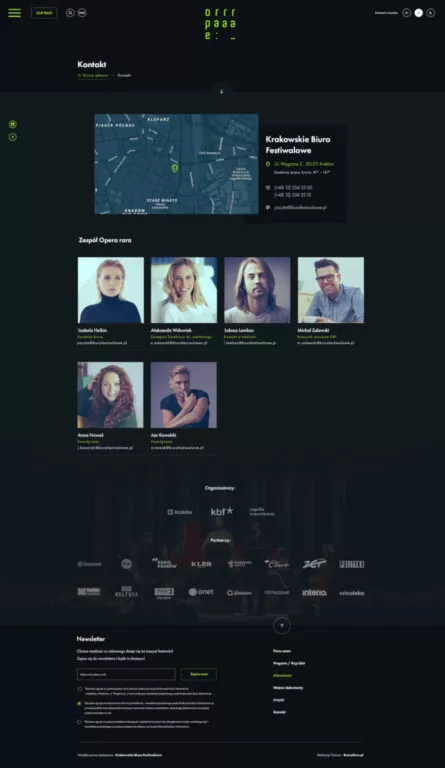
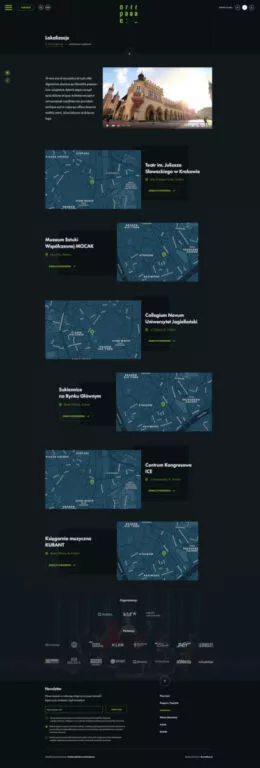
When we started working on the project, we knew that the website was to be a database of all information about festivals and places where users could check the program and event locations. Links to the ticketing system for organised events and concerts also had to be included.
The main assumption, which we took into account at all stages of the work, was the convenience of using the service and logical arrangement of content on the site.
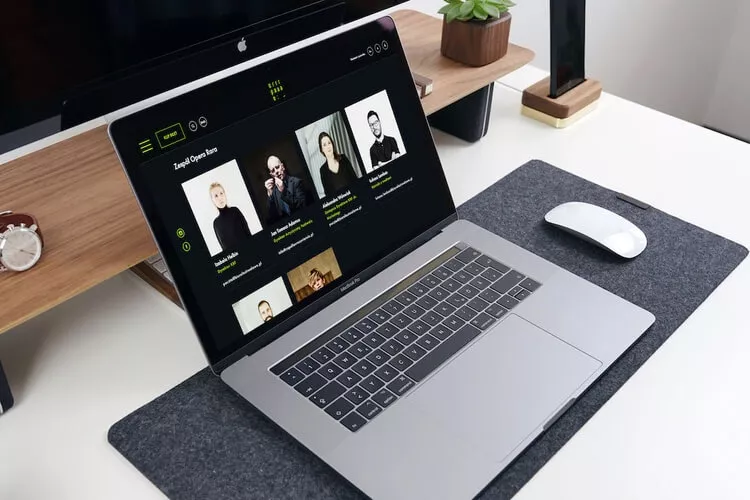
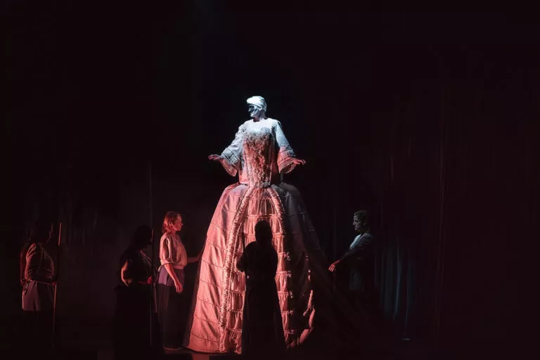
In the presentation of the work, we used photos of Edyta Dufaj
What was important for us?
Design i usability
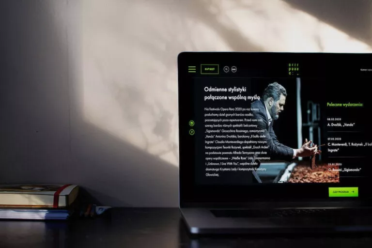
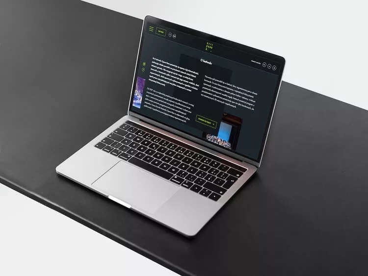
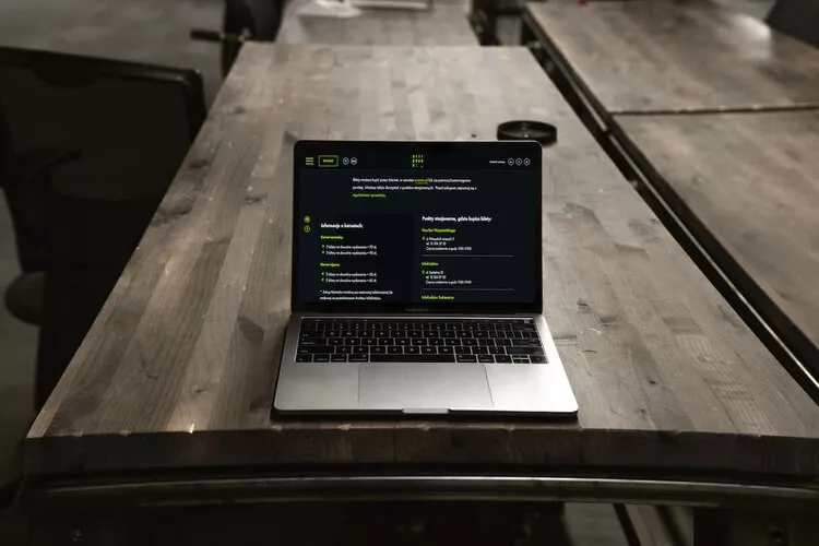
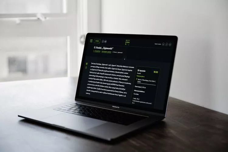
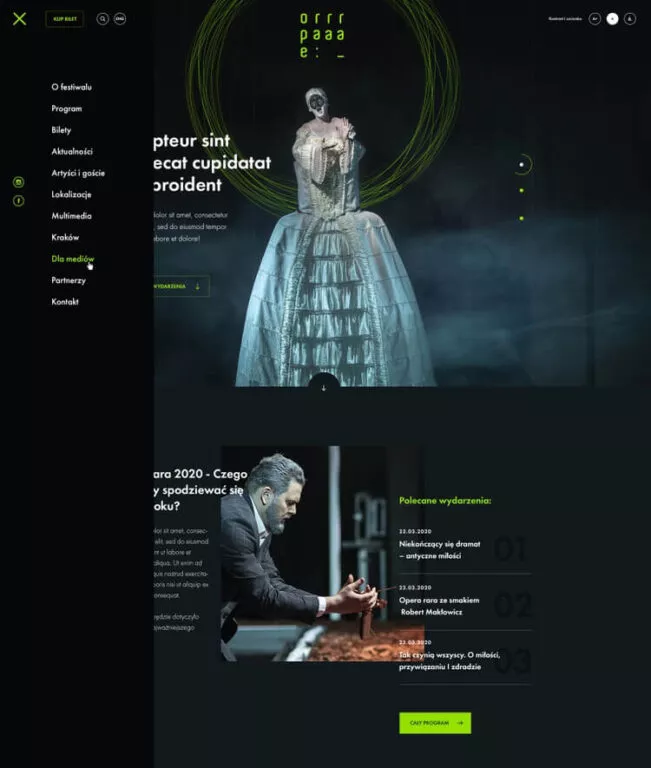
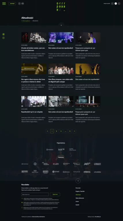
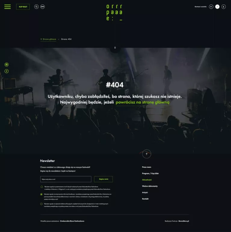
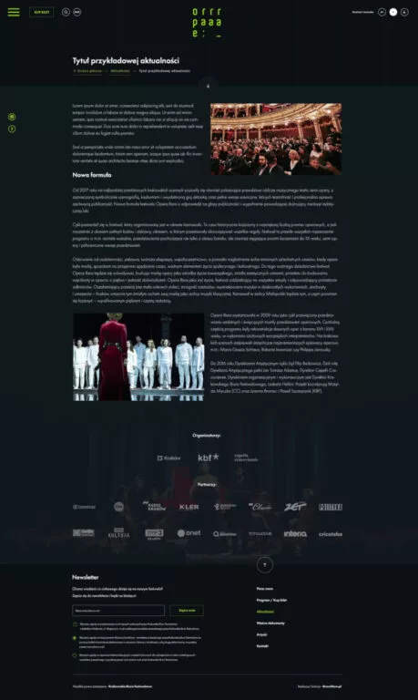
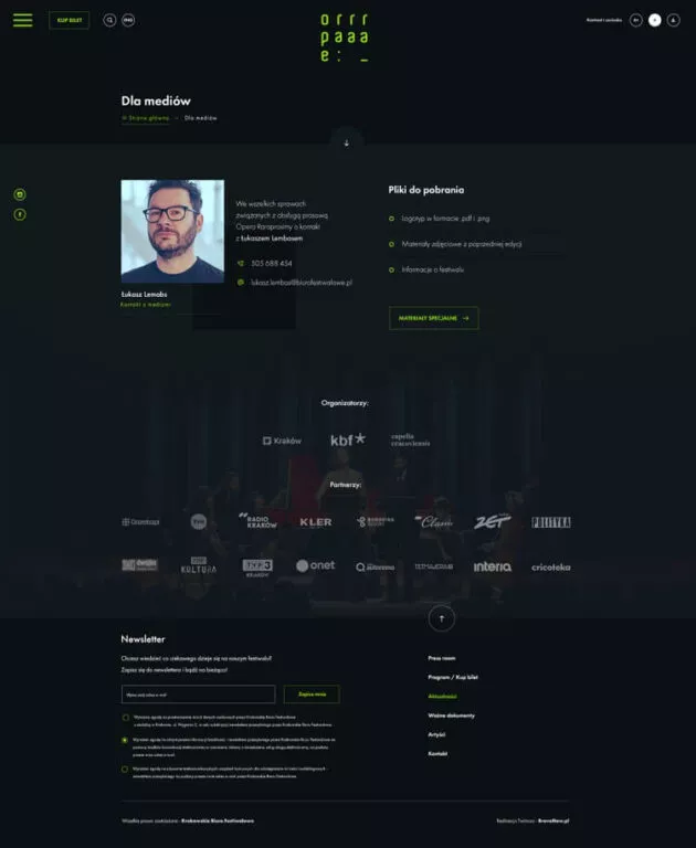
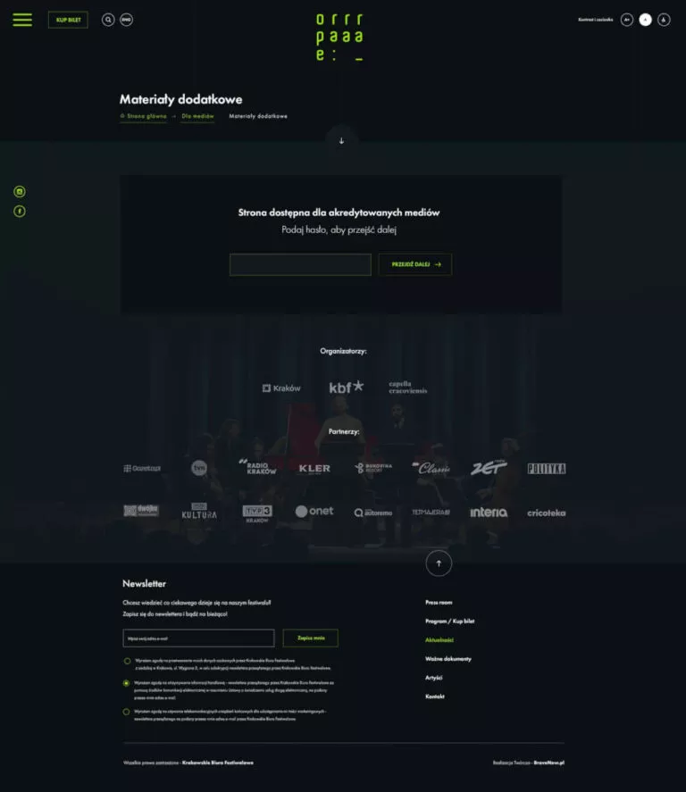
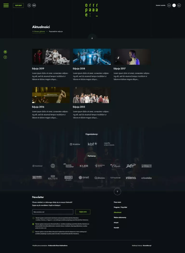
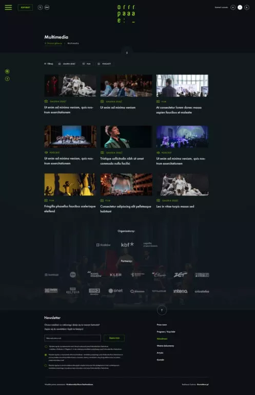
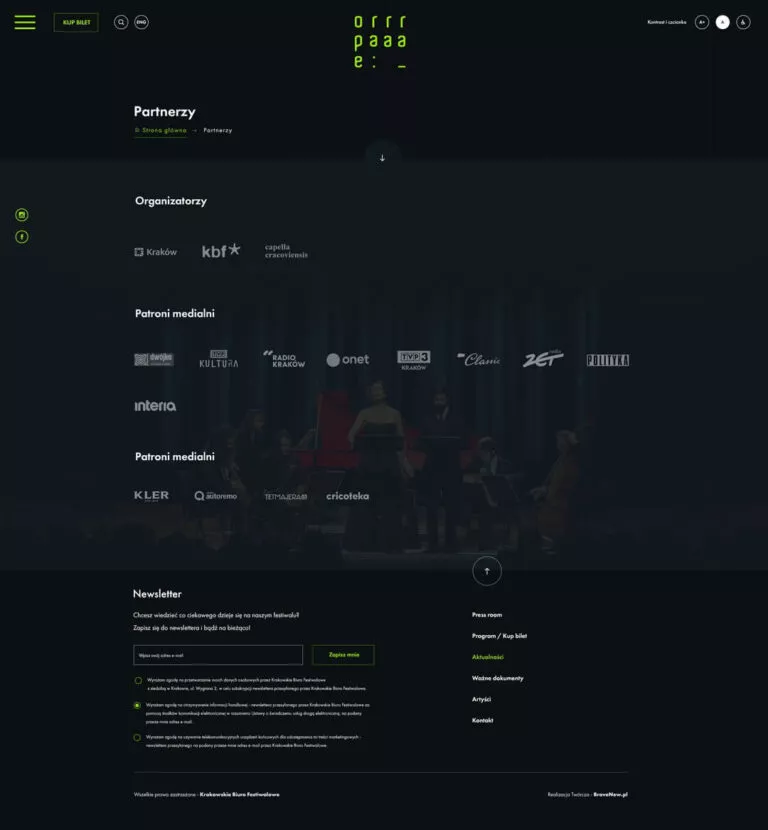
The website of the festival has undergone a complete transformation in visual terms. The first element that can be seen after opening the site is the new colour scheme, using elements of visual identification. The combination of a dark background with a distinct shade of green reflects the atmosphere of the event, beauty and symbolizes a break from everyday life. The photos provided by the organizers of the event helped to highlight the artistic character of the event.Interactive schedule
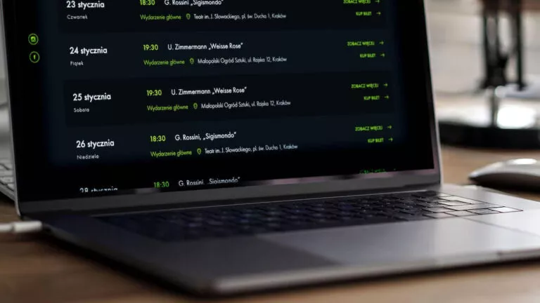
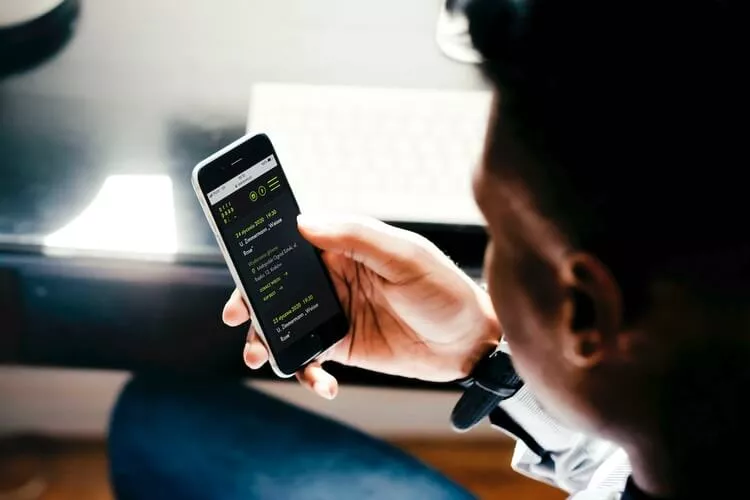
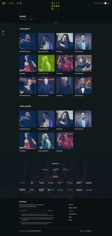
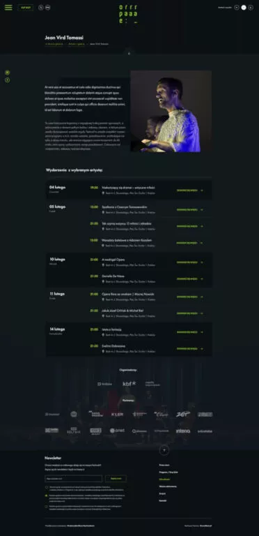
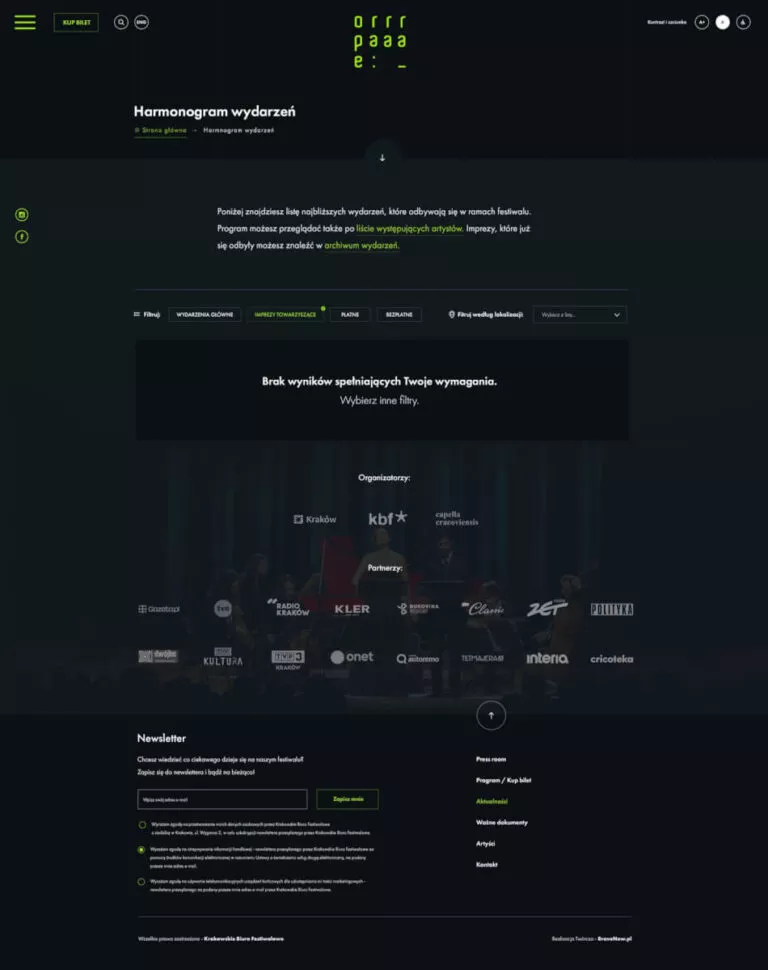
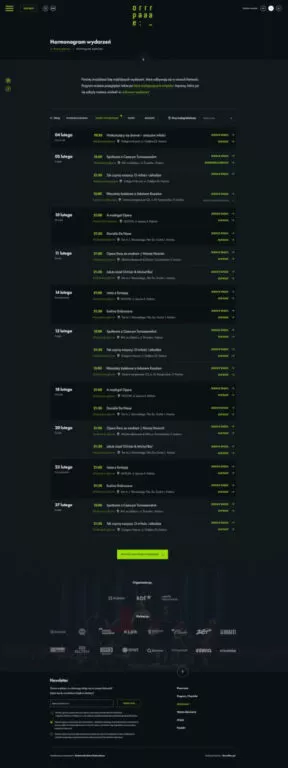
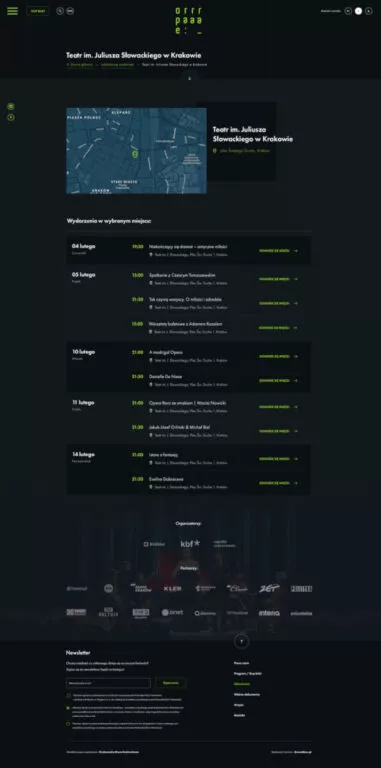
One of the most interesting features is the schedule. The event program has been equipped with extensive dynamic filtering. What's more, the various departments - locations, artists and events - have been logically linked to each other so that the user can quickly find the information they need. So the guests navigate the site intuitively, moving from one section to another.A site for people with disabilities and two language versions
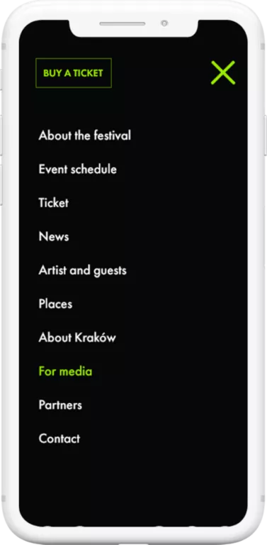
All content on the website is available in two language versions. The site also includes facilities for people with disabilities, which can change the text size and contrast.Full content management system on the site
The administrator can freely change the content and photos within the whole service, as well as add new sections and modify them easily. The site is very well optimized and fast. Its refreshment had a positive impact on the number of users and increased the average time spent by visitors on the site.
What was the work on the project like?
After learning about the issues that the festivals website had, we began to create information architecture. We have planned work consisting in improving the operation of all sections, organization of content on the site and the main assumptions of the graphic design.
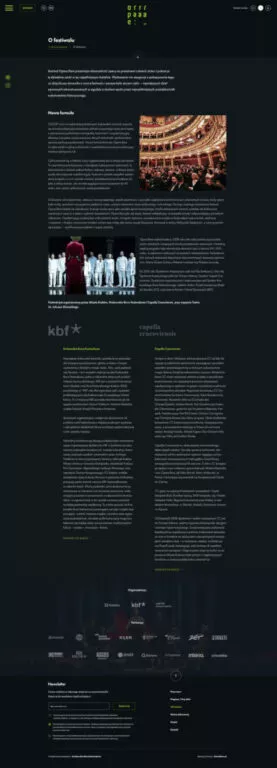
While creating views of all subpages, we were inspired by the symbols and examples used in visual identification and previously prepared promotional materials.
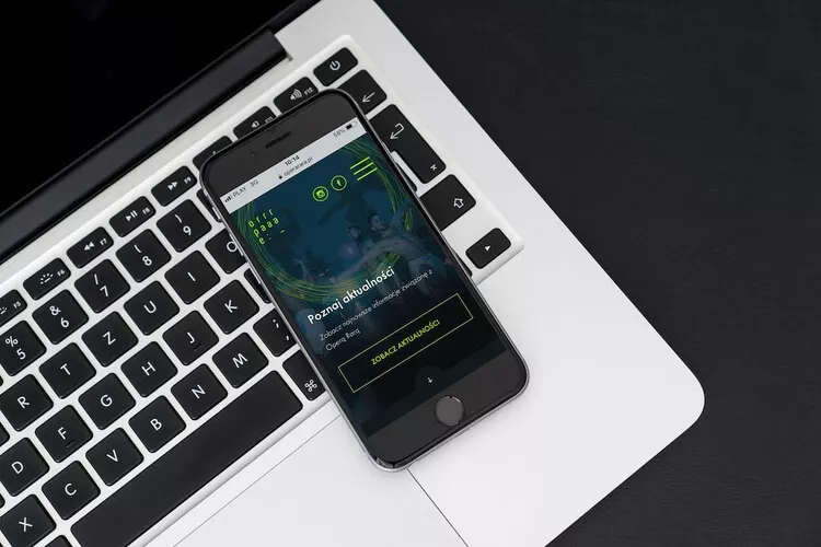
The graphic design, apart from its aesthetic values, has been designed in such a way as to present in an understandable way all the functionalities that can be used on the website.
The coding stage consisted of preparing all functionalities so that administrators could modify the site’s content themselves in the future. For artists, events and locations, we have prepared separate sections to keep the back room tidy and make content management even easier.
The last part of the project was to complete all the content on the site. Archival entries were moved from the old site and new subpages were supplemented with texts provided by the organizers. The whole has been completed with artistic pictures from previous editions of the festival.
Scope of work
- Webdesign
- Website coding
- Creating an extensive schedule of online events
- Adaptation of the website to WCAG standards
- Migration of content
- Technical support after launch of the website
